
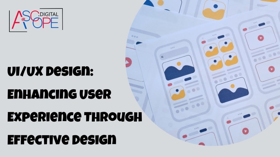
Understanding the Fundamentals of UI/UX Design
In the realm of digital design, UI (User Interface) and UX (User Experience) are terms that are often used interchangeably, yet they represent distinctly different aspects of the design process. Understanding the fundamentals of UI/UX design is crucial for creating products that are not only visually appealing but also functional and user-friendly.
What is UI Design?
UI design refers to the visual elements of a product, such as buttons, icons, spacing, typography, and color schemes. It is the graphical layout of an application or a website. The goal of UI design is to guide users through an interface intuitively, ensuring that each element is visually appealing and serves a clear purpose.
Key aspects of UI design include:
- Consistency: A consistent UI design helps users to predict interactions and understand the application more quickly. This involves using similar design patterns, colors, fonts, and layouts across all pages of the application.
- Visual Hierarchy: This principle ensures that the most important elements are the most prominent. It guides users’ eyes to what’s important, helping them to navigate the interface effectively.
- Accessibility: UI design must cater to all users, including those with disabilities. This involves using readable fonts, high-contrast color schemes, and keyboard-friendly navigation.
What is UX Design?
UX design, on the other hand, focuses on the overall experience a user has with a product. It encompasses all aspects of the end-user’s interaction, from the moment they first discover the product to the point where they stop using it. The goal of UX design is to create a product that is easy to use, efficient, and enjoyable.
Key aspects of UX design include:
- User Research: This involves understanding the needs, behaviors, and goals of your users through methods like interviews, surveys, and usability testing. Insights from user research inform design decisions and ensure the product meets user expectations.
- Information Architecture: This refers to the way information is organized and structured within a product. A well-thought-out information architecture helps users find what they are looking for quickly and easily.
- Interaction Design: This involves designing interactive elements that facilitate user tasks. It focuses on how users interact with the interface, including animations, button clicks, and navigational flows.
- Prototyping and Testing: UX designers create prototypes to test ideas and gather user feedback before finalizing the design. This iterative process helps in identifying usability issues early and refining the product to better meet user needs.
The Intersection of UI and UX
While UI and UX are distinct disciplines, they are closely intertwined. A beautifully designed interface can fail if the overall user experience is poor, and vice versa. Successful digital products require a harmonious blend of both UI and UX design.
For instance, consider a mobile app for banking. The UI design would focus on making the app visually appealing, with a clean layout, attractive colors, and intuitive icons. However, the UX design would ensure that users can perform tasks like checking their balance, transferring funds, and paying bills effortlessly. The app must provide a seamless experience, from the ease of login to the speed of transactions.
Principles of Effective UI/UX Design
To achieve a balance between UI and UX, designers should adhere to several core principles:
- User-Centric Design: Always prioritize the needs and preferences of the users. Involve them in the design process through feedback and testing.
- Simplicity: Strive for simplicity in design. Avoid clutter and focus on what’s essential to the user. A simple design is often more effective and easier to use.
- Flexibility and Efficiency: Design interfaces that cater to both novice and expert users. Provide shortcuts and customization options for experienced users while keeping basic functions straightforward for beginners.
- Feedback: Provide users with clear and immediate feedback on their actions. Whether it’s a button click or a form submission, users should know the result of their interaction.
- Aesthetic Integrity: Ensure that the visual design aligns with the function of the product. Aesthetic elements should enhance usability, not hinder it.
The Importance of User Research and Personas

In the dynamic field of UI/UX design, understanding your users is paramount to creating successful digital products. User research and personas are critical tools in this process, providing deep insights into user behavior, needs, and motivations. By investing time in user research and creating detailed personas, designers can ensure that their products are both user-centric and effective.
What is User Research?
User research involves collecting and analyzing data about users’ needs, behaviors, and experiences. This research can be conducted through various methods, including interviews, surveys, focus groups, usability testing, and analytics. The goal is to gather actionable insights that inform design decisions and ensure that the end product aligns with user expectations.
Key methods of user research include:
- Interviews: One-on-one conversations with users to gain in-depth understanding of their needs, motivations, and pain points. Interviews can reveal personal experiences and nuanced perspectives that other methods might miss.
- Surveys and Questionnaires: These are useful for gathering quantitative data from a larger audience. They help identify common trends and preferences among users.
- Focus Groups: Group discussions that provide a platform for users to express their thoughts and opinions about a product or concept. This method can uncover diverse viewpoints and foster idea generation.
- Usability Testing: Observing users as they interact with a product to identify usability issues and areas for improvement. This hands-on approach provides direct feedback on the user experience.
- Analytics: Analyzing data from existing products to understand user behavior, such as how users navigate a site, which features they use most, and where they encounter difficulties.
The Role of Personas in Design
Personas are fictional characters created based on user research data. They represent different user types that might use a product, each with specific characteristics, goals, and behaviors. Personas help designers empathize with users and make informed decisions that cater to the target audience.
Creating personas involves several steps:
- Data Collection: Gather data from user research to identify common patterns and characteristics among users.
- Segmentation: Group users with similar attributes into clusters. Each cluster will form the basis of a persona.
- Profile Creation: Develop detailed profiles for each persona, including demographic information, goals, needs, frustrations, and behavioral traits.
- Scenario Development: Create scenarios or stories that illustrate how each persona would interact with the product in different contexts.
Benefits of User Research and Personas
Investing in user research and personas offers numerous benefits:
- Enhanced User Empathy: Personas help designers and stakeholders understand and empathize with users. This empathy ensures that design decisions are user-centered and address real user needs.
- Informed Design Decisions: User research provides concrete data that guides design choices. Rather than relying on assumptions, designers can base their decisions on factual insights, leading to more effective and user-friendly products.
- Improved Usability: Understanding user behavior and preferences helps in designing intuitive interfaces. Usability testing, a key component of user research, identifies issues early, allowing for timely corrections.
- Targeted Marketing: Personas can also inform marketing strategies. By understanding the characteristics and needs of different user groups, marketing efforts can be tailored to resonate more effectively with the target audience.
- Stakeholder Alignment: Personas and research findings provide a common reference point for all project stakeholders. This alignment ensures that everyone is on the same page regarding user needs and design priorities.
Practical Application of User Research and Personas
To effectively utilize user research and personas, follow these practical steps:
- Continuous Research: User research should be an ongoing process. Continuously gather feedback and update personas to reflect changes in user behavior and preferences.
- Involve Users Early: Engage users from the beginning of the design process. Early involvement ensures that user needs are identified and addressed from the start.
- Iterative Design: Use an iterative design approach, where prototypes are tested with users, and feedback is incorporated into subsequent versions. This cycle of testing and refinement enhances the final product’s usability.
- Cross-Functional Collaboration: Involve team members from different disciplines, such as designers, developers, marketers, and product managers, in the user research process. This collaboration ensures that insights are integrated across the project.
- Documentation and Sharing: Document research findings and personas thoroughly. Share these documents with the entire team to ensure that everyone understands the user needs and design rationale.
Design Principles for Intuitive User Interfaces

Creating an intuitive user interface (UI) is essential for ensuring that users can navigate and interact with a digital product effortlessly. Intuitive design minimizes the learning curve, reduces user frustration, and enhances overall user satisfaction. To achieve this, designers must adhere to several key principles that guide the development of user-friendly and efficient interfaces.
1. Consistency
Consistency is a cornerstone of intuitive UI design. It involves maintaining uniformity in visual elements, interaction patterns, and terminology throughout the product. Consistent design helps users form mental models, making it easier for them to predict the behavior of interface elements.
- Visual Consistency: Use consistent color schemes, typography, and iconography across all screens. For example, buttons with the same function should have the same color and shape throughout the application.
- Functional Consistency: Ensure that similar actions yield similar results. For instance, a swipe gesture should perform the same action across different sections of a mobile app.
- Internal and External Consistency: Maintain consistency not only within the product but also with established conventions and standards from other products and platforms. This helps users transfer their knowledge and expectations seamlessly.
2. Clarity
Clarity is crucial for helping users understand the interface quickly and accurately. An interface should communicate its purpose and functionality clearly, reducing the cognitive load on users.
- Simplified Content: Use concise and straightforward language. Avoid jargon and unnecessary technical terms. For example, instead of “Initiate Download,” use “Download.”
- Legible Typography: Choose fonts that are easy to read and ensure adequate contrast between text and background. Appropriate font sizes and spacing enhance readability.
- Intuitive Icons and Labels: Use familiar icons and provide clear labels to explain their functions. Icons should be easily recognizable and convey their meaning without ambiguity.
3. Feedback
Providing feedback is essential for keeping users informed about the status of their actions. Feedback can be visual, auditory, or haptic, and it helps users understand whether their actions were successful, need correction, or are in progress.
- Action Confirmation: Show confirmation messages or animations when users complete an action, such as submitting a form or saving changes.
- Error Messages: Provide clear and helpful error messages that explain what went wrong and how to fix it. For example, if a user enters an invalid email address, the error message should specify the issue.
- Loading Indicators: Use progress bars, spinners, or other indicators to show that a task is in progress. This reassures users that the system is working and prevents frustration during waiting times.
4. Affordance
Affordance refers to the design of UI elements in a way that suggests their functionality. Users should be able to identify actionable items and understand how to interact with them at a glance.
- Button Design: Make buttons look clickable by using visual cues such as shadows, gradients, or borders. Ensure that buttons are distinct from other UI elements.
- Interactive Elements: Design interactive elements, such as links and form fields, to stand out. For example, underlined text typically indicates a clickable link.
- Physical Metaphors: Use physical metaphors to convey functionality. For instance, a trash bin icon for deleting items or a magnifying glass for search.
5. User Control
An intuitive interface gives users control over their actions and allows them to make decisions without feeling restricted or overwhelmed.
- Undo and Redo: Provide options to undo and redo actions. This feature gives users the confidence to explore and experiment without the fear of making irreversible mistakes.
- Customizability: Allow users to customize their experience, such as adjusting settings or rearranging elements to suit their preferences.
- Clear Navigation: Design navigation systems that are easy to understand and use. Ensure that users can move back and forth between screens without losing their place.
6. Accessibility
An intuitive UI should be accessible to all users, including those with disabilities. Accessibility ensures that everyone can interact with the product effectively.
- Keyboard Navigation: Ensure that all interactive elements can be accessed and operated using a keyboard. This is essential for users who cannot use a mouse.
- Screen Reader Compatibility: Design interfaces that work well with screen readers, providing descriptive alt text for images and proper labeling for form fields.
- Contrast and Color: Use high-contrast color combinations to improve readability for users with visual impairments. Avoid relying solely on color to convey information.
7. Simplicity
Simplicity is about reducing complexity and focusing on essential elements. An uncluttered interface allows users to find information and complete tasks quickly.
- Minimalist Design: Remove unnecessary elements that do not add value to the user experience. Use whitespace effectively to create a clean and organized layout.
- Prioritized Content: Highlight the most important information and actions. Ensure that primary actions are easily accessible and secondary actions are less prominent.
- Streamlined Processes: Simplify workflows and reduce the number of steps required to complete tasks. For example, use autofill options to minimize data entry in forms.
Creating Seamless Navigation and Information Architecture

In the world of UI/UX design, seamless navigation and robust information architecture are crucial components of a successful digital product. These elements ensure that users can easily find what they are looking for, understand how to get there, and navigate the product efficiently. This section will delve into the principles and best practices for creating effective navigation and information architecture, highlighting their importance in enhancing user experience.
Understanding Navigation and Information Architecture
Navigation refers to the system by which users move through a website or application. It includes menus, links, buttons, and other interactive elements that guide users from one page or section to another. Effective navigation helps users understand where they are, where they can go, and how to get there efficiently.
Information Architecture (IA) involves the organization, structuring, and labeling of content in a way that makes it easy for users to find information and complete tasks. Good IA ensures that content is logically grouped, easily searchable, and accessible.
Principles of Seamless Navigation
- Simplicity and Clarity
Navigation should be simple and clear, avoiding unnecessary complexity that can confuse users. A straightforward navigation system helps users focus on their tasks without being overwhelmed by too many options or unclear labels.
- Minimalist Menus: Use concise and intuitive labels for menu items. Limit the number of top-level navigation items to avoid clutter.
- Descriptive Labels: Ensure that navigation labels accurately describe the content or action they lead to. Avoid ambiguous terms that might confuse users.
- Consistency
Consistency in navigation across different pages and sections of a product is key to providing a seamless user experience. Users should be able to predict the behavior of navigation elements based on their previous interactions.
- Uniform Design Patterns: Use consistent design patterns for navigation elements, such as buttons and links. This includes colors, styles, and placements.
- Predictable Locations: Place navigation elements in predictable locations. For example, a horizontal navigation bar at the top of the page or a vertical menu on the left side.
- User-Centric Design
Navigation should be designed with the user’s needs and preferences in mind. Conduct user research to understand how users navigate and what their common paths and goals are.
- User Testing: Test navigation designs with real users to identify pain points and areas for improvement. Use feedback to refine the navigation system.
- Persona-Based Navigation: Tailor navigation options based on user personas. Different user groups may have different needs and preferred paths.
- Visual Hierarchy
A clear visual hierarchy in navigation helps users quickly identify primary and secondary navigation options. Use visual cues to differentiate between levels of navigation.
- Prominent Primary Navigation: Make primary navigation items more prominent using size, color, or positioning.
- Secondary Navigation: Use dropdown menus or nested lists for secondary and tertiary navigation items, keeping them accessible but not overpowering the primary options.
- Accessibility
Ensure that navigation is accessible to all users, including those with disabilities. This involves designing navigation elements that are easy to use with assistive technologies.
- Keyboard Navigation: Ensure that all navigation elements can be accessed and used with a keyboard. This is crucial for users who cannot use a mouse.
- Screen Reader Compatibility: Design navigation that works well with screen readers, providing clear labels and logical order for navigation items.
Principles of Effective Information Architecture
- Clear Organization
Organize content in a way that aligns with user expectations and logical groupings. This helps users find information quickly and efficiently.
- Content Grouping: Group related content together. Use categories and subcategories to create a logical structure.
- Hierarchical Structure: Implement a hierarchical structure where broader categories encompass more specific subcategories. This makes it easier for users to navigate through layers of information.
- Intuitive Labeling
Use intuitive and descriptive labels for content categories and navigation items. Clear labeling helps users understand the content and its location.
- User-Friendly Language: Use language that is familiar to your users. Avoid technical jargon or overly complex terms.
- Descriptive Titles: Ensure that titles and headings accurately reflect the content they represent.
- Search Functionality
Provide robust search functionality to help users find specific content quickly, especially on content-heavy sites.
- Advanced Search Options: Offer advanced search options, such as filters and sorting, to help users refine their search results.
- Autocomplete and Suggestions: Implement autocomplete and search suggestions to assist users in finding relevant content as they type.
- Scalability
Design the information architecture to accommodate future growth. A scalable IA ensures that new content can be added without disrupting the existing structure.
- Flexible Structure: Create a flexible structure that can easily incorporate new categories and subcategories.
- Content Management: Use a content management system (CMS) that supports easy updates and additions to the IA.
- User Pathways
Design clear user pathways that guide users through the content. This involves anticipating user journeys and ensuring that each step is logical and intuitive.
- Breadcrumbs: Use breadcrumb navigation to show users their current location within the IA and allow them to navigate back to previous levels.
- Contextual Links: Provide contextual links within content to guide users to related information and further reading.
Best Practices for Seamless Navigation and Information Architecture
- Card Sorting: Conduct card sorting exercises with users to understand how they categorize information. This helps in creating an IA that aligns with user mental models.
- Wireframes and Prototypes: Use wireframes and prototypes to visualize and test navigation and IA before full-scale development. This allows for early identification of issues and iterative improvements.
- Analytics and Monitoring: Continuously monitor user behavior using analytics tools. Analyze navigation patterns, drop-off points, and search queries to identify areas for improvement.
- Responsive Design: Ensure that navigation and IA are responsive and work well on different devices, including desktops, tablets, and smartphones. Mobile-friendly design is crucial for a seamless user experience across platforms.
The Role of Visual Hierarchy and Typography
In UI/UX design, visual hierarchy and typography are critical elements that significantly influence the user experience. By guiding users’ attention and making content easy to read and navigate, these elements ensure that users can interact with digital products efficiently and effectively. This section will explore the importance of visual hierarchy and typography, their principles, and best practices for implementing them in design.
Understanding Visual Hierarchy
Visual hierarchy refers to the arrangement and presentation of elements in a way that conveys their relative importance. It guides users through the content, helping them understand what to focus on first and what to look at next. A well-defined visual hierarchy makes it easier for users to navigate and comprehend information.
Key principles of visual hierarchy include:
- Size and Scale
Larger elements attract more attention than smaller ones. By varying the size and scale of different elements, designers can indicate their importance.
- Headings and Subheadings: Use larger font sizes for headings and subheadings to differentiate them from body text and signal their importance.
- Call-to-Action (CTA) Buttons: Make CTA buttons larger and more prominent to encourage user interaction.
- Color and Contrast
Color and contrast help distinguish elements and create visual interest. High-contrast elements stand out more and draw the user’s eye.
- Highlighting Key Elements: Use contrasting colors to highlight key elements, such as buttons, links, and important information.
- Consistent Color Scheme: Maintain a consistent color scheme to ensure a cohesive design while using color strategically to create hierarchy.
- Spacing and Proximity
The use of space and the arrangement of elements can indicate their relationship and importance. Elements that are closer together are perceived as related, while those with more space around them stand out.
- White Space: Utilize white space to separate different sections and create a clean, organized layout. This helps users focus on individual elements without feeling overwhelmed.
- Grouping Related Items: Group related items together to show their connection and make information easier to scan.
- Typography and Font Styles
Different font styles, weights, and sizes contribute to visual hierarchy by distinguishing various types of content.
- Bold and Italic Text: Use bold or italic text to emphasize important points or headings.
- Different Font Families: Use different font families or styles to create contrast between headings, subheadings, and body text.
The Importance of Typography
Typography is the art and technique of arranging type to make written language legible, readable, and visually appealing. Good typography enhances the overall design and significantly impacts user experience.
Key principles of typography include:
- Legibility
Legibility refers to how easily individual characters can be distinguished from one another. Ensuring legibility is crucial for effective communication.
- Readable Fonts: Choose fonts that are easy to read on different screen sizes and resolutions. Avoid overly decorative fonts that can hinder legibility.
- Font Size and Line Height: Use appropriate font sizes and line heights to ensure text is easy to read. Larger font sizes improve readability, especially for body text.
- Readability
Readability involves how easily blocks of text can be read and understood. It encompasses factors like font choice, text size, line spacing, and text alignment.
- Optimal Line Length: Maintain an optimal line length of 50-75 characters per line. Lines that are too long or too short can strain the eyes and disrupt reading flow.
- Adequate Line Spacing: Use adequate line spacing (leading) to prevent text from appearing cramped. This enhances the reading experience and reduces eye fatigue.
- Hierarchy and Structure
Typography helps create a clear hierarchy and structure within the content, guiding users through the information in a logical order.
- Consistent Typographic Scale: Establish a typographic scale that defines font sizes for different levels of headings, subheadings, and body text. This creates a visual hierarchy and makes the content easier to scan.
- Emphasis and Contrast: Use typographic emphasis, such as bold, italic, and different font weights, to create contrast and highlight important information.
- Alignment and Spacing
Proper alignment and spacing contribute to a clean and organized design, enhancing the overall readability and visual appeal.
- Text Alignment: Use left-aligned text for most body content, as it is easier to read. Center-aligned text can be used for headings or short blocks of text to create visual interest.
- Consistent Margins and Padding: Maintain consistent margins and padding around text blocks to create a balanced layout.
Best Practices for Implementing Visual Hierarchy and Typography
- Use a Grid System
A grid system helps maintain consistency and alignment throughout the design. It provides a structured framework for placing elements and ensures a cohesive layout.
- Baseline Grid: Use a baseline grid to align text and maintain consistent spacing between lines of text.
- Column Grid: Implement a column grid to organize content and create a balanced design.
- Create a Style Guide
A style guide documents the visual and typographic standards for a project. It ensures consistency across different pages and sections of the product.
- Typography Guidelines: Include guidelines for font choices, sizes, weights, and line spacing in the style guide.
- Color and Spacing Standards: Define color schemes, spacing, and alignment rules to maintain a consistent visual hierarchy.
- Test and Iterate
Regularly test your design with real users to gather feedback and identify areas for improvement. Iterative testing helps ensure that the visual hierarchy and typography effectively guide users and enhance their experience.
- A/B Testing: Conduct A/B testing to compare different typographic and hierarchical choices and determine which works best for your users.
- Usability Testing: Perform usability testing to observe how users interact with the design and identify any readability or navigational issues.
Incorporating User Feedback and Iterative Testing

Incorporating user feedback and iterative testing are fundamental practices in UI/UX design that ensure the creation of user-centric products. By continuously gathering feedback and refining designs based on real user interactions, designers can enhance usability, address pain points, and ultimately deliver a product that meets and exceeds user expectations. This section explores the importance, methods, and best practices for integrating user feedback and iterative testing into the design process.
The Importance of User Feedback
User feedback is invaluable in the design process because it provides direct insights into how users interact with a product, what they like, and what challenges they face. Understanding these aspects helps designers make informed decisions that improve the overall user experience.
Key benefits of user feedback include:
- Identifying Usability Issues: Users can highlight problems that designers might overlook, such as confusing navigation, unclear instructions, or difficult-to-use features.
- Validating Design Choices: Feedback helps validate whether design decisions align with user needs and preferences.
- Enhancing User Satisfaction: Addressing user concerns and incorporating their suggestions fosters a sense of involvement and increases satisfaction and loyalty.
- Driving Innovation: Users often provide innovative ideas and suggestions that can lead to new features or improvements.
Methods of Gathering User Feedback
Several methods can be used to gather user feedback effectively:
- Surveys and Questionnaires
Surveys and questionnaires are excellent tools for collecting quantitative and qualitative data from a broad audience. They can be distributed online, making it easy to reach a large number of users.
- Design-Specific Questions: Ask specific questions related to design elements, such as ease of navigation, clarity of information, and visual appeal.
- Open-Ended Questions: Include open-ended questions to allow users to provide detailed feedback and suggestions.
- User Interviews
One-on-one interviews provide in-depth insights into user experiences, behaviors, and preferences. They allow for a deeper understanding of user needs and pain points.
- Structured and Unstructured Interviews: Use a mix of structured questions to gather specific information and unstructured questions to explore user thoughts and feelings more freely.
- Follow-Up Questions: Ask follow-up questions based on user responses to delve deeper into their experiences and uncover underlying issues.
- Usability Testing
Usability testing involves observing users as they interact with a product to identify issues and areas for improvement. This hands-on method provides direct feedback on the user experience.
- Task-Based Testing: Give users specific tasks to complete while observing their interactions. Note any difficulties or confusion they encounter.
- Think-Aloud Protocol: Encourage users to verbalize their thoughts as they navigate the product. This provides insights into their decision-making process and identifies pain points.
- Analytics and User Behavior Tracking
Analyzing user behavior through tools like Google Analytics, heatmaps, and session recordings provides valuable data on how users interact with a product.
- Usage Patterns: Identify common navigation paths, frequently accessed pages, and points of drop-off to understand user behavior.
- Heatmaps: Use heatmaps to see where users click, scroll, and spend the most time, helping identify areas of interest and potential issues.
The Role of Iterative Testing
Iterative testing is the process of continuously testing and refining a product based on user feedback and testing results. This approach allows for gradual improvements and ensures that the final product meets user needs effectively.
Key principles of iterative testing include:
- Continuous Improvement
Iterative testing is an ongoing process that involves making small, incremental changes based on feedback and testing results. This ensures that improvements are continuously integrated into the design.
- Cycle of Testing and Refinement: Implement a cycle where feedback is gathered, changes are made, and the revised design is tested again. Repeat this cycle until the product meets user expectations.
- Prioritizing Changes: Prioritize changes based on the impact on user experience and feasibility. Address critical issues first, followed by less urgent improvements.
- Prototyping
Prototyping is a crucial aspect of iterative testing, allowing designers to create and test versions of a product before full-scale development. Prototypes can range from simple sketches to high-fidelity interactive models.
- Low-Fidelity Prototypes: Use low-fidelity prototypes, such as wireframes and sketches, in the early stages to quickly test ideas and gather feedback.
- High-Fidelity Prototypes: Develop high-fidelity prototypes with more detailed designs and interactions for more accurate testing and feedback.
- A/B Testing
A/B testing involves comparing two or more versions of a design to determine which performs better. This method provides quantitative data on user preferences and behavior.
- Controlled Experiments: Conduct controlled experiments where users are randomly assigned to different versions of a design. Measure and compare their interactions and outcomes.
- Metrics and KPIs: Define metrics and key performance indicators (KPIs) to evaluate the success of each version. Common metrics include conversion rates, task completion times, and user satisfaction scores.
- Feedback Integration
Effectively integrating feedback into the design process ensures that user insights are translated into actionable improvements.
- Feedback Prioritization: Prioritize feedback based on its impact on usability and user experience. Focus on addressing the most critical issues first.
- Collaboration and Communication: Foster collaboration between designers, developers, and stakeholders to ensure feedback is understood and effectively implemented.
Best Practices for Incorporating User Feedback and Iterative Testing
- Early and Frequent Testing
Start testing early in the design process and conduct tests frequently. Early testing helps identify issues before they become deeply embedded in the design, saving time and resources.
- Initial Concept Testing: Test initial concepts and ideas to validate their viability and gather early feedback.
- Ongoing User Involvement: Involve users throughout the design process, from initial prototypes to final iterations.
- Diverse User Representation
Ensure that feedback is gathered from a diverse group of users to capture a wide range of perspectives and needs.
- User Demographics: Include users from different demographic backgrounds, skill levels, and experiences to get a comprehensive view of user needs.
- Edge Cases: Consider edge cases and less common user scenarios to ensure the design accommodates all potential users.
- Transparent Communication
Maintain transparent communication with users about how their feedback is being used. This fosters trust and encourages ongoing participation.
- Feedback Acknowledgment: Acknowledge user feedback and communicate any changes or improvements made as a result.
- User Involvement: Involve users in the testing and feedback process by sharing results and updates.
Balancing Aesthetics and Functionality in Design

In UI/UX design, balancing aesthetics and functionality is crucial for creating digital products that are not only visually appealing but also highly usable. A well-designed product must captivate users with its appearance while ensuring that it meets their needs efficiently. This section explores the principles and best practices for achieving a harmonious balance between aesthetics and functionality in design.
The Importance of Aesthetics in Design
Aesthetics play a significant role in the overall user experience by influencing first impressions and emotional responses. Visually appealing designs can attract users, build brand identity, and enhance user satisfaction.
Key aspects of aesthetics include:
- Visual Appeal
A visually appealing design captures users’ attention and makes a positive first impression. It encourages users to engage with the product and explore its features.
- Color Schemes: Use harmonious color schemes that evoke the desired emotions and align with the brand’s identity. Color can influence mood and perception, so choose wisely.
- Typography: Select fonts that are not only readable but also contribute to the overall aesthetic. Typography should reflect the brand’s personality and enhance the visual appeal.
- Brand Identity
Consistent and thoughtful design elements help build a strong brand identity. Aesthetic consistency across all touchpoints reinforces brand recognition and trust.
- Visual Consistency: Maintain consistent use of colors, fonts, and imagery to create a cohesive brand experience.
- Imagery and Icons: Use high-quality images and icons that align with the brand’s message and values. Avoid generic or irrelevant visuals.
- User Engagement
Aesthetically pleasing designs can increase user engagement by making interactions more enjoyable. Visual appeal can motivate users to spend more time exploring the product.
- Interactive Elements: Use visually appealing interactive elements, such as animations and transitions, to enhance user engagement. However, ensure that these elements do not compromise functionality.
The Role of Functionality in Design
While aesthetics are important, functionality is the backbone of any digital product. A design that looks good but fails to meet user needs will ultimately be unsuccessful. Functionality ensures that users can achieve their goals efficiently and effectively.
Key aspects of functionality include:
- Usability
Usability refers to how easily users can navigate and interact with a product. A functional design prioritizes ease of use and intuitiveness.
- Intuitive Navigation: Design clear and straightforward navigation paths. Users should be able to find what they need without confusion.
- Effective Layouts: Organize content in a logical and easy-to-follow manner. Use grids and alignment to create structured layouts that guide the user’s eye.
- Accessibility
Functional designs are inclusive and accessible to all users, regardless of their abilities. Accessibility ensures that everyone can use the product effectively.
- Keyboard Navigation: Ensure that all interactive elements can be accessed and operated using a keyboard. This is crucial for users with motor impairments.
- Screen Reader Compatibility: Design interfaces that work well with screen readers. Provide descriptive alt text for images and proper labeling for form fields.
- Performance
A functional design performs well across different devices and conditions. It loads quickly, responds promptly to user interactions, and operates smoothly.
- Optimized Load Times: Optimize images, scripts, and other assets to reduce load times. Slow-loading pages can frustrate users and increase bounce rates.
- Responsive Design: Ensure that the design adapts seamlessly to different screen sizes and orientations. A responsive design enhances usability on both desktop and mobile devices.
Achieving Balance Between Aesthetics and Functionality
Balancing aesthetics and functionality requires a thoughtful approach that considers the needs and preferences of users while maintaining visual appeal. Here are some best practices to achieve this balance:
- User-Centered Design
Prioritize the needs and preferences of your users. Conduct user research to understand their goals, behaviors, and pain points. Use this information to inform design decisions.
- User Personas: Develop user personas to represent different segments of your audience. Design with these personas in mind to ensure that the product meets their needs.
- User Testing: Continuously test your design with real users to gather feedback and identify areas for improvement. Incorporate this feedback into iterative design cycles.
- Collaborative Design Process
Foster collaboration between designers, developers, and stakeholders to ensure that both aesthetics and functionality are considered throughout the design process.
- Design Sprints: Use design sprints to rapidly prototype and test ideas. This collaborative approach helps align aesthetic and functional goals early in the process.
- Cross-Functional Teams: Involve team members from different disciplines, such as UI designers, UX researchers, and developers, to bring diverse perspectives to the design.
- Iterative Design
Adopt an iterative design approach that allows for continuous refinement and improvement. This helps maintain a balance between aesthetics and functionality as the product evolves.
- Prototyping: Create prototypes to test and validate design concepts. Use both low-fidelity and high-fidelity prototypes to explore different aspects of the design.
- Feedback Loops: Establish feedback loops to gather input from users, stakeholders, and team members. Use this feedback to make informed design decisions.
- Design Systems
Implement a design system that provides a set of guidelines and reusable components. This ensures consistency and efficiency in both aesthetic and functional aspects of the design.
- Component Libraries: Develop a library of design components that can be reused across different parts of the product. This promotes consistency and saves time.
- Style Guides: Create a style guide that outlines the visual and functional standards for the product. This serves as a reference for the entire team.
- Prioritization
Prioritize design elements based on their impact on user experience. Focus on features that provide the most value to users while maintaining a visually appealing design.
- MVP Approach: Start with a minimum viable product (MVP) that includes the core features and aesthetics. Gradually add enhancements based on user feedback and testing.
- Critical Path: Identify the critical path that users follow to achieve their goals. Ensure that this path is both aesthetically pleasing and highly functional.
Conclusion
Balancing aesthetics and functionality in design is essential for creating digital products that are both visually captivating and highly usable. By prioritizing user needs, fostering collaboration among team members, and adopting an iterative design approach, designers can achieve a harmonious balance that enhances the overall user experience. Implementing design systems and focusing on key elements ensure consistency and efficiency, making the design process more effective. In today’s competitive digital landscape, products that seamlessly integrate aesthetics and functionality not only attract users but also drive long-term engagement and satisfaction. For further insights on optimizing your website’s performance and attracting more traffic, read more on the other reasons why your website isn’t getting traffic.