
Logos are crucial in establishing a brand’s identity. Among the various types of logos, wordmark logos, also known as logotypes, stand out for their simplicity and effectiveness. A wordmark logo relies entirely on text to represent a brand, making the choice of font, color, and design elements critical. In this article, we will delve into the art of crafting memorable wordmark logos, exploring their history, significance, design principles, and examples of successful wordmark logos.
The History of Wordmark Logos
Wordmark logos have been around for centuries, evolving with changes in design trends and technology. The earliest forms of wordmark logos can be traced back to the use of distinctive typefaces in ancient manuscripts and inscriptions. However, it was in the 20th century that wordmark logos gained prominence, with brands like Coca-Cola and IBM setting the standard for this logo type. These early examples demonstrated how powerful typography could be in conveying a brand’s message and personality.
Significance of Wordmark Logos
Wordmark logos are significant for several reasons. Firstly, they are highly versatile and can be easily scaled across various media, from business cards to billboards. Secondly, they are often more straightforward to recognize and remember since they directly incorporate the brand’s name. This clarity can enhance brand recall and loyalty. Additionally, wordmark logos can convey professionalism and sophistication, making them a popular choice for industries such as fashion, technology, and finance.
Key Elements of a Memorable Wordmark Logo
Creating a memorable wordmark logo involves careful consideration of several key elements. These include typography, color, spacing, and overall design harmony. Let’s explore each of these elements in detail.
Typography in Wordmark Logos
The choice of typography is perhaps the most critical aspect of a wordmark logo. The font style should reflect the brand’s personality and values. For instance, a luxury brand might opt for an elegant serif font, while a tech startup might choose a sleek sans-serif font. Custom typefaces can also be created to give a unique identity to the brand. It’s important to consider legibility and scalability when selecting a font, ensuring that the logo remains clear and readable at different sizes.
Color Selection in Wordmark Logos
Color plays a vital role in logo design, influencing perceptions and emotions. In wordmark logos, the color choice should align with the brand’s identity and the message it wants to convey. For example, blue is often associated with trust and professionalism, making it a popular choice for corporate brands. Red can evoke excitement and passion, suitable for brands in the entertainment or sports industries. It’s essential to use colors that are visually appealing and ensure good contrast for readability.
Spacing and Alignment in Wordmark Logos
Proper spacing and alignment are crucial for creating a balanced and harmonious wordmark logo. Kerning, the adjustment of space between letters, can significantly impact the logo’s overall appearance. Adequate spacing ensures that the logo is easily readable and aesthetically pleasing. Alignment also plays a role in creating a polished look, with options like left-aligned, centered, or justified text depending on the desired effect.
Design Harmony in Wordmark Logos
Achieving design harmony involves ensuring that all elements of the logo work together cohesively. This includes the interplay between typography, color, and spacing. A well-designed wordmark logo should appear unified and consistent, reflecting the brand’s identity seamlessly. Designers often create multiple iterations and variations before finalizing a logo to ensure it meets all these criteria.
Case Studies of Successful Wordmark Logos
To better understand the principles of wordmark logo design, let’s examine some successful examples.
Coca-Cola

Coca-Cola’s wordmark logo is one of the most recognizable in the world. Its distinctive Spencerian script font, combined with the red and white color scheme, creates a sense of tradition and nostalgia. The logo has remained relatively unchanged since its creation in the late 19th century, demonstrating the enduring power of a well-crafted wordmark.

Google’s wordmark logo is a modern classic. The clean, sans-serif font reflects the company’s focus on simplicity and innovation. The use of primary colors (blue, red, yellow, and green) adds a playful and approachable feel. Google’s logo has undergone subtle refinements over the years, but its core design principles have remained consistent.
FedEx

The FedEx wordmark logo is renowned for its clever use of negative space. The bold, sans-serif font is straightforward and professional, while the hidden arrow between the ‘E’ and ‘x’ symbolizes speed and precision. The purple and orange color scheme adds vibrancy and energy to the logo.
Designing a Wordmark Logo: Step-by-Step Guide
Creating a wordmark logo involves a systematic design process. Here’s a step-by-step guide to help you craft a memorable text-based logo.
Step 1: Define the Brand Identity
Before starting the design process, it’s essential to understand the brand’s identity, values, and target audience. This information will guide the choice of typography, color, and overall style. Conducting a brand audit and competitor analysis can provide valuable insights.
Step 2: Choose the Right Typography
Based on the brand identity, select a font that reflects the desired personality and message. Experiment with different typefaces, considering custom options if necessary. Ensure the font is legible and scalable across various applications.
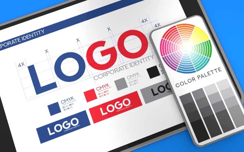
Step 3: Select a Color Palette
Choose colors that align with the brand’s identity and evoke the desired emotions. Create a color palette that includes primary and secondary colors for flexibility in different contexts. Test the colors for readability and contrast.
Step 4: Adjust Spacing and Alignment
Fine-tune the spacing between letters (kerning) and ensure proper alignment for a balanced and harmonious look. Pay attention to details, as small adjustments can make a significant difference in the overall appearance.
Step 5: Test and Refine
Create multiple iterations of the logo and test them in different sizes and contexts. Gather feedback from stakeholders and make necessary refinements. Ensure the final logo is versatile and effective across various media.
Step 6: Finalize and Implement
Once the logo is finalized, create a comprehensive brand guideline document that includes specifications for typography, color, spacing, and usage. This document will ensure consistency in the logo’s application across all brand materials.
Common Mistakes to Avoid in Wordmark Logo Design
Designing a wordmark logo can be challenging, and there are common mistakes to avoid.
Overcomplicating the Design
Simplicity is key in wordmark logos. Avoid adding unnecessary elements or embellishments that can detract from the logo’s clarity and impact. Focus on creating a clean and straightforward design.
Ignoring Legibility
Legibility is crucial for wordmark logos, as they rely entirely on text. Ensure that the font is readable at different sizes and that there is sufficient contrast between the text and background.
Using Trendy Fonts
While it can be tempting to use trendy fonts, they may quickly become outdated. Opt for timeless typefaces that will remain relevant and effective for years to come.
Poor Color Choices
Color selection should be deliberate and aligned with the brand’s identity. Avoid using colors that clash or are difficult to read. Test the logo in grayscale to ensure it maintains its effectiveness without color.
Neglecting Scalability
A wordmark logo should be scalable and adaptable to various applications. Test the logo in different sizes and formats to ensure it remains clear and impactful.
The Future of Wordmark Logos
As design trends and technologies evolve, wordmark logos will continue to play a vital role in brand identity. The future may see more dynamic and interactive wordmark logos, incorporating animation and responsive design elements. However, the core principles of simplicity, legibility, and coherence will remain essential.
Maximizing the Impact of Your Wordmark Logo
Conclusion
Wordmark logos are a powerful tool in a brand’s visual identity, offering clarity, versatility, and memorability. By understanding the key elements of typography, color, spacing, and design harmony, you can create a wordmark logo that effectively represents your brand. Learning from successful examples and following a systematic design process will help you craft a memorable and impactful text-based logo. As you embark on this creative journey, remember that simplicity and attention to detail are the cornerstones of a successful wordmark logo.