
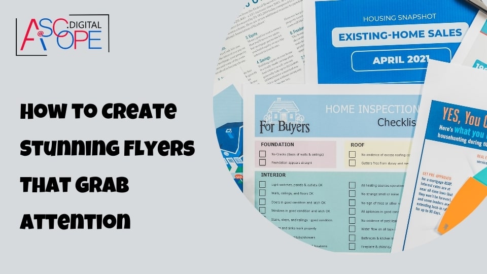
In today’s fast-paced world, grabbing someone’s attention is more challenging than ever. With countless digital and print materials competing for our eyes, standing out requires more than just good design—it demands creativity, precision, and an understanding of what truly captures interest. Flyers, though often underestimated, are one of the most effective tools for marketing and communication. Whether promoting an event, a product, or a service, a stunning flyer can make all the difference. Here’s a comprehensive guide on how to create stunning flyers that grab attention and leave a lasting impression.
Understanding Your Audience to Create Stunning Flyers
Before diving into the design process, it’s crucial to understand who your audience is. Knowing your target demographic helps tailor the Stunning Flyers to meet their preferences and needs. Ask yourself: Who is this flyer for? What age group, interests, and behaviors characterize my target audience? For example, a Stunning Flyers aimed at teenagers will look vastly different from one intended for corporate professionals. This understanding not only shapes the visual elements but also influences the tone and language used. Researching and creating detailed audience personas can significantly enhance the effectiveness of your flyer by ensuring every element resonates with the intended recipients.
Define Your Objective
Every stunning flyer should have a clear objective. What do you want to achieve with this flyer? Are you looking to promote a sale, announce an event, or introduce a new product? Defining the objective will guide the design process and ensure the flyer conveys the intended message effectively. A well-defined objective acts as the foundation for your flyer, influencing both the content and the design. It helps in prioritizing information, selecting appropriate visuals, and crafting a compelling call to action. Without a clear objective, the flyer may lack direction and fail to engage the audience effectively.
Crafting the Perfect Headline
The headline is the first thing people see on a flyer, and it must be compelling enough to grab their attention immediately. A good headline is clear, concise, and relevant to the audience. Use action words and make sure it stands out on the page. For instance, instead of “Annual Sale,” you might opt for “Unbelievable Savings at Our Annual Sale!” The headline should evoke curiosity and interest, encouraging the reader to explore further. Experiment with different fonts, sizes, and colors to make the headline pop. Additionally, aligning the headline with the Stunning Flyers overall theme and purpose ensures a cohesive and impactful first impression.
Use Subheadings Wisely
Subheadings break up the text and make the stunning flyers easier to read. They provide a way to highlight key points and guide the reader through the information. Subheadings should be straightforward and descriptive, helping the reader understand the content at a glance. They act as signposts, drawing attention to important sections and making the Stunning Flyers more navigable. Thoughtfully crafted subheadings can transform a dense block of text into a well-organized and engaging layout. Pair subheadings with relevant visuals or icons to further enhance readability and retention. This strategic use of subheadings ensures that even a quick scan of the flyer conveys the essential information effectively.
Enhancing Visual Appeal
Visual appeal is a critical component of a stunning flyer. Utilize high-quality images, graphics, and colors that align with your brand and resonate with your audience. Consider the emotional response you want to evoke and choose visuals accordingly. Consistency in design elements such as fonts, colors, and layouts across different stunning flyers also helps in building brand recognition and trust.
Effective Use of White Space
White space, or negative space, is the area of the flyer that is left unmarked. Proper use of white space can significantly enhance the readability and aesthetics of your flyer. It helps in creating a clean and uncluttered look, allowing the reader to focus on the essential elements. Avoid cramming too much information into a small space. Instead, strategically place text and images to create a balanced and harmonious design.
Incorporating a Call to Action (CTA)
A compelling call to action is crucial for converting interest into action. Clearly state what you want the reader to do next, whether it’s visiting a website, attending an event, or taking advantage of a special offer. Use persuasive language and ensure the CTA stands out on the flyer. Consider using buttons or highlighted text to draw attention to the CTA.
Proofreading and Testing
Before finalizing your flyer, it’s essential to proofread the content for any spelling or grammatical errors. Additionally, test the flyer by sharing it with a small group of people who resemble your target audience. Gather feedback and make necessary adjustments to ensure the flyer communicates the intended message effectively.
Design Elements That Catch the Eye
Creating a visually appealing flyer involves a blend of various design elements that work together to grab attention and convey your message effectively. Here’s a comprehensive guide to the critical components that can make your flyer stand out:
Color Choices
Color plays a significant role in design, as it can evoke emotions and set the tone for your stunning flyer. When selecting a color scheme, consider the psychological impact of different colors and how they align with your brand and target audience. For instance, bold, contrasting colors can draw attention to important information, making it stand out. On the other hand, a more subdued palette might be suitable for a professional event, conveying a sense of sophistication and elegance. Use colors consistently to maintain brand identity and ensure visual coherence across all design elements.
Typography
The choice of fonts can make or break a flyer. Typography is not just about selecting a font; it’s about ensuring readability and enhancing the overall aesthetic of the flyer. Use fonts that are easy to read and match the style and tone of the flyer. Generally, it’s best to stick to two or three different fonts to maintain a clean and cohesive look. Use larger fonts for headlines and subheadings to capture attention, and smaller fonts for body text to provide detailed information. Pay attention to font spacing, alignment, and hierarchy to guide the reader’s eye through the content seamlessly.
Images and Graphics
High-quality images and graphics can significantly enhance the appeal of your flyer. Visual elements should be relevant to the message and help illustrate the content. Avoid using generic stock images that may appear impersonal and instead opt for original graphics or photos whenever possible. This adds authenticity and uniqueness to your flyer, making it more engaging and memorable. Ensure that the images are high resolution and properly aligned with the overall design to maintain a professional appearance.
Layout and Composition
The layout of your flyer should be well-organized and balanced. A structured layout ensures that all elements are aligned and spaced consistently, creating a clean and professional look. Use a grid system to achieve this alignment and balance. Leave enough white space to avoid clutter, which makes the content easier to read and digest. A well-composed layout guides the reader’s eye naturally through the flyer, highlighting key information and ensuring a smooth flow from one section to the next.
The Power of a Call to Action
A call to action (CTA) is a crucial component of any flyer, as it tells the reader what you want them to do next. Whether it’s visiting a website, calling a number, or attending an event, your CTA should be clear, direct, and compelling. Use action-oriented phrases like “Don’t Miss Out,” “Register Now,” or “Visit Us Today” to encourage immediate action. Place the CTA in a prominent location on the flyer, and use contrasting colors or bold fonts to make it stand out.
Ensuring Readability
No matter how visually appealing a flyer is, if the text is hard to read, it won’t be effective. Ensure there is enough contrast between the text and the background to enhance readability. Avoid placing text over busy images, as this can make the content difficult to decipher. Use bullet points or lists to break down information into easily scannable sections, making it quicker for readers to grasp the key points.
Proofreading
Before printing or distributing your flyer, proofread it thoroughly. Typos and grammatical errors can undermine the professionalism of your flyer and distract from your message. Consider having a colleague or professional proofreader review the content to catch any mistakes you might have missed. Attention to detail in proofreading can significantly impact the perceived quality of your flyer.
Additional Tips for Effective Flyer Design
- Consistency: Maintain a consistent design style throughout the flyer. This includes using the same color palette, fonts, and imagery style.
- Branding: Incorporate your brand elements, such as logos and taglines, to reinforce brand identity.
- Purposeful Design: Ensure that every element on the flyer serves a purpose and contributes to the overall message.
- Target Audience: Design with your target audience in mind, considering their preferences and what will resonate with them.
- Testing: If possible, test different designs with a small audience to see which version is most effective before doing a full print run.
Printing Considerations
The quality of the print can greatly impact the effectiveness of your flyer. Choose a reputable printing service that offers high-quality materials and finishes. Consider options like glossy or matte finishes, and ensure the paper weight is suitable for your needs. A flimsy flyer can make a bad impression, whereas a sturdy, well-printed stunning flyer conveys quality and attention to detail.
Distribution Strategies
Even the most stunning flyer won’t be effective if it doesn’t reach the right people. Plan your distribution strategy carefully. Handing out flyers in high-traffic areas, mailing them to targeted lists, or including them in promotional packages can help get your stunning flyer into the hands of your intended audience.
Leveraging Digital Channels
In addition to physical distribution, consider leveraging digital channels. Share your flyer on social media, include it in email newsletters, and upload it to your website. This not only extends your reach but also allows for easy sharing and wider dissemination.
Measuring Success
To determine the effectiveness of your stunning flyer, track its performance. This can be done through unique promotional codes, dedicated landing pages, or simply by asking new customers how they heard about your event or promotion. Analyzing this data will provide valuable insights and help improve future stunning flyer campaigns.
Conclusion
Creating a stunning flyer that grabs attention involves a combination of understanding your audience, clear objectives, compelling design, and strategic distribution. By focusing on these elements, you can create a flyer that not only stands out but also effectively communicates your message and drives the desired action. Thus, improving traffic and sales for your website. Read more on the other reasons why your website isn’t getting traffic.