
Understanding the Purpose and Audience
In the realm of poster design, understanding the purpose and audience is paramount. A well-crafted poster can captivate attention, convey a message succinctly, and drive action. However, achieving these goals requires a deep understanding of the poster’s intent and the people it aims to reach. Here’s an in-depth look at how to master this crucial aspect of poster design.
Defining the Purpose
The first step in poster design is to clearly define its purpose. Is the poster meant to inform, persuade, entertain, or promote? The purpose will significantly influence the design choices, from layout and typography to color scheme and imagery. For instance, a poster for a music festival will have a vastly different design approach compared to a public health awareness poster.
- Informational Posters: These are designed to convey important information, such as event details, schedules, or educational content. Clarity and readability are crucial. Use straightforward language, clear headings, and organized layouts to ensure the information is easily digestible.
- Persuasive Posters: Often used in advertising or advocacy campaigns, these posters aim to convince the audience to take a specific action, such as buying a product, attending an event, or supporting a cause. Emotional appeal, striking visuals, and compelling calls to action are key elements.
- Entertainment Posters: These are typically used for events like concerts, movies, or theater productions. The design should reflect the mood and theme of the event, using bold colors, dynamic compositions, and engaging imagery to capture excitement and interest.
- Promotional Posters: These serve to market products, services, or events. The focus is on highlighting the benefits and unique features, using attention-grabbing visuals and persuasive text.
Identifying the Audience
Once the purpose is defined, the next step is to identify the target audience. Understanding who the poster is meant for will guide many design decisions, ensuring the final product resonates with the intended viewers.
- Demographics: Consider factors such as age, gender, income level, education, and occupation. A poster targeting young adults for a music festival will differ significantly from one aimed at retirees for a health seminar.
- Psychographics: Delve into the audience’s interests, values, lifestyles, and behaviors. Understanding these aspects will help in creating a design that appeals to their preferences and motivations. For example, a poster for a fitness event targeting health-conscious individuals might use vibrant colors, energetic imagery, and motivational language.
- Cultural Sensitivity: Be mindful of cultural nuances and sensitivities. Colors, symbols, and language can have different connotations in different cultures. Researching and respecting these differences is crucial to avoid misunderstandings or offense.
Crafting a Message that Resonates
With a clear purpose and a well-defined audience, the next step is crafting a message that resonates. The message should be concise, clear, and compelling, tailored to both the purpose and the audience.
- Headline: The headline is the first thing people will see, so it needs to grab attention immediately. It should be bold, engaging, and to the point. For example, “Join the Fitness Revolution!” is more compelling than “Fitness Event Coming Soon.”
- Subheadings and Body Text: Use subheadings to break down information into manageable sections. The body text should be clear and concise, avoiding jargon unless it’s well understood by the target audience. Highlight key points and use bullet points for easy readability.
- Call to Action (CTA): Every poster should include a clear CTA, guiding the audience on what to do next. Whether it’s “Buy Tickets Now,” “Learn More,” or “Join Us,” the CTA should stand out and be easy to follow.
Design Elements that Enhance Communication
The design elements chosen should enhance the communication of the message, making it attractive and easy to understand.
- Typography: Select fonts that are readable and appropriate for the poster’s purpose and audience. Avoid using too many different fonts, as it can create a cluttered look.
- Color Scheme: Choose colors that align with the poster’s theme and evoke the desired emotions. For example, red can convey urgency or excitement, while blue can create a sense of trust and calm.
- Imagery: Use high-quality images and graphics that support the message. Imagery should be relevant and visually appealing, helping to draw attention and reinforce the poster’s purpose.
- Layout: A well-organized layout helps guide the viewer’s eye through the poster. Use grids to maintain alignment and balance, and ensure there is enough white space to avoid a cluttered appearance.
Testing and Feedback
Before finalizing the poster, it’s important to test its effectiveness. Share the design with a small segment of the target audience to gather feedback. Are they drawn to the poster? Is the message clear? Does the design compel them to take action? Use this feedback to make necessary adjustments.
Choosing the Right Typography
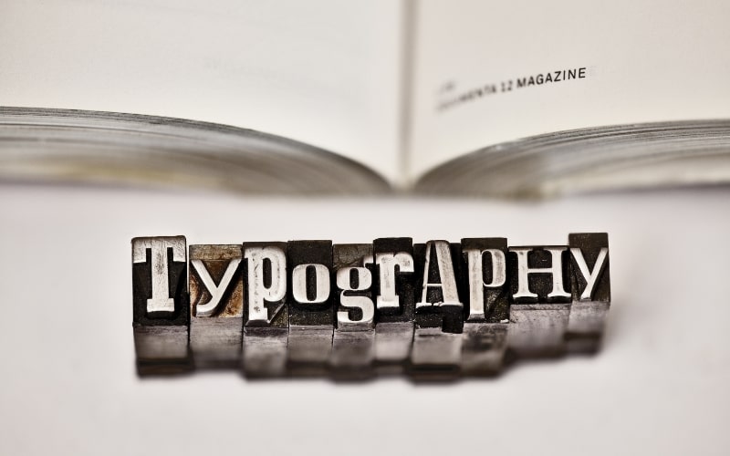
Typography plays a crucial role in poster design, significantly impacting how the message is perceived and understood by the audience. Choosing the right typography involves more than simply selecting a font; it requires an understanding of the principles of typography, the context of the design, and the needs of the audience. Here’s an in-depth look at how to master the art of choosing the right typography for your poster.
Understanding Typography Basics
- Font vs. Typeface: A typeface is a family of fonts, while a font is a specific style within that family. For instance, Helvetica is a typeface, and Helvetica Bold is a font within that typeface.
- Serif vs. Sans-Serif: Serif fonts have small lines or embellishments at the ends of their characters, which can create a traditional and formal look. Sans-serif fonts lack these lines, offering a modern and clean appearance.
- Script and Decorative Fonts: Script fonts mimic cursive handwriting and can add a personal, elegant touch. Decorative fonts are unique and stylized, often used for impact rather than readability.
Matching Typography to Purpose and Audience
Choosing the right typography starts with understanding the purpose of your poster and the audience it aims to reach.
- Purpose Alignment:
- Informational Posters: Prioritize readability with clean, simple fonts. Sans-serif fonts like Arial or Helvetica work well for body text, while a bold serif font can be used for headings.
- Persuasive Posters: Use fonts that evoke emotion and capture attention. A combination of a strong, bold font for headlines and a readable sans-serif font for body text can be effective.
- Entertainment Posters: Experiment with fun and dynamic fonts that reflect the event’s theme. Script or decorative fonts can be used sparingly to add flair, but ensure the main message remains legible.
- Promotional Posters: Highlight key features and benefits with clear, impactful fonts. Use a hierarchy of fonts to guide the viewer through the information seamlessly.
- Audience Consideration:
- Age: Younger audiences might respond better to modern, trendy fonts, while older audiences may prefer classic, easily readable typefaces.
- Interests: Tailor the typography to the audience’s interests. A tech-savvy audience might appreciate sleek, futuristic fonts, while an artsy crowd might enjoy more creative and expressive typefaces.
- Cultural Sensitivity: Be aware of cultural connotations associated with certain fonts. For example, some script fonts may evoke traditional or historical associations in different cultures.
Creating a Hierarchy
Typography hierarchy is essential for guiding the viewer’s eye through the poster in a logical and engaging manner.
- Headlines: The headline is the most prominent text on the poster and should be the first thing that catches the viewer’s eye. Use a bold, attention-grabbing font and a larger size.
- Subheadings: Subheadings break down the content into digestible sections. Choose a font that complements the headline but is slightly smaller and less bold.
- Body Text: For the body text, prioritize readability. A clean sans-serif font in a readable size ensures that the information is easy to consume.
- Call to Action (CTA): The CTA should stand out. Use a contrasting font or color to draw attention and make it clear what action the viewer should take.
Combining Fonts Effectively
Using multiple fonts can add visual interest to your poster, but it’s important to combine them thoughtfully.
- Limit the Number of Fonts: Stick to two or three fonts to avoid a cluttered and chaotic look. Use one font for headings, another for body text, and possibly a third for special emphasis.
- Contrast and Complement: Choose fonts that contrast yet complement each other. For instance, pair a bold, decorative font for headings with a simple, clean sans-serif font for body text.
- Consistency: Maintain consistency in font usage throughout the poster. This creates a cohesive and professional appearance.
Enhancing Readability and Legibility
No matter how stylish a font is, readability and legibility are paramount.
- Font Size: Ensure that the font size is appropriate for the viewing distance. Headlines should be large enough to grab attention from a distance, while body text should be easily readable up close.
- Line Spacing and Letter Spacing: Adequate line spacing (leading) and letter spacing (tracking) improve readability. Too little spacing can make the text look cramped, while too much spacing can make it look disjointed.
- Contrast with Background: Ensure there is sufficient contrast between the text and the background. Dark text on a light background or light text on a dark background enhances legibility.
- Avoiding Overuse of Effects: While effects like shadows, outlines, and gradients can add emphasis, overusing them can make the text hard to read. Use such effects sparingly and purposefully.
Testing and Refining
Before finalizing the typography, it’s important to test its effectiveness.
- Print and View at Actual Size: Print the poster at its intended size to see how the typography looks in real life. Ensure that all text is readable from the intended viewing distance.
- Gather Feedback: Share the design with a small segment of your target audience to gather feedback. Pay attention to comments on readability and overall impression.
- Refine Based on Feedback: Use the feedback to make necessary adjustments. This iterative process helps ensure that the final typography choice meets both design and audience needs.
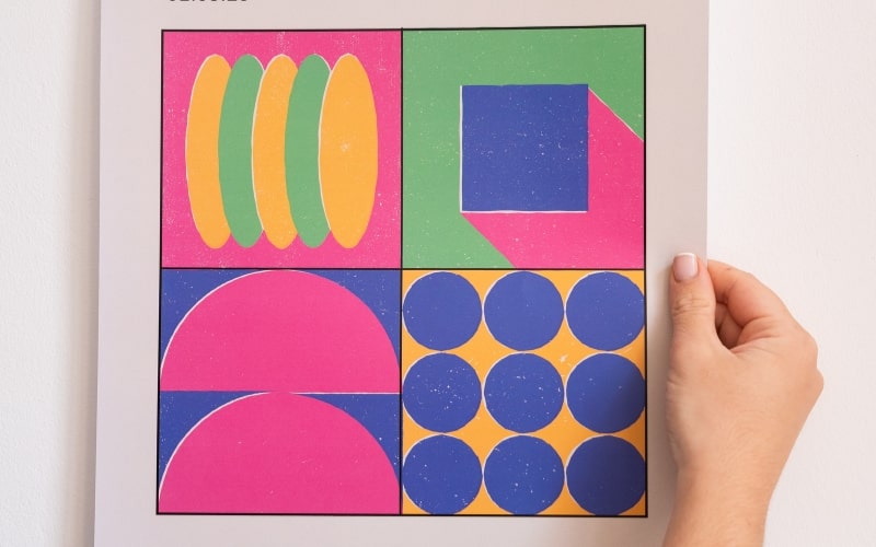
Effective Use of Color and Contrast

Color and contrast are powerful tools in poster design, capable of drawing attention, conveying emotions, and enhancing readability. When used effectively, they can transform a simple poster into a compelling visual communication piece. This section delves into the principles of color theory, the impact of contrast, and practical tips for using color and contrast to create stunning posters.
Understanding Color Theory
- Color Wheel: The color wheel is a fundamental tool for understanding how colors relate to each other. It consists of primary colors (red, blue, yellow), secondary colors (green, orange, purple), and tertiary colors (combinations of primary and secondary colors).
- Color Harmony: Color harmony involves combining colors in a way that is pleasing to the eye. There are several schemes for achieving color harmony:
- Analogous Colors: These are colors that are next to each other on the color wheel. They create a serene and comfortable design. For example, blue, green, and turquoise.
- Complementary Colors: These are colors opposite each other on the color wheel. They provide a high contrast and vibrant look, making elements stand out. For example, red and green.
- Triadic Colors: These are three colors evenly spaced around the color wheel. They offer a balanced and dynamic color scheme. For example, red, yellow, and blue.
- Color Temperature: Colors can be categorized as warm (reds, oranges, yellows) or cool (blues, greens, purples). Warm colors are associated with energy and excitement, while cool colors evoke calmness and serenity.
The Psychological Impact of Color
Colors evoke specific emotions and associations, which can influence how your poster is perceived.
- Red: Associated with energy, passion, and urgency. It can be used to grab attention and create excitement.
- Blue: Conveys trust, calmness, and professionalism. It’s a popular choice for corporate and informational posters.
- Green: Symbolizes nature, health, and tranquility. It’s often used in designs related to the environment or well-being.
- Yellow: Represents happiness, optimism, and warmth. It can be used to create a cheerful and inviting atmosphere.
- Black: Denotes sophistication, elegance, and power. It can add a sense of luxury and authority to your design.
- White: Signifies purity, simplicity, and cleanliness. It’s often used as a background color to create a sense of space and clarity.
Using Contrast Effectively
Contrast is essential for creating visual interest and ensuring readability. It involves the difference between two elements, making them stand out from each other.
- Color Contrast: High color contrast between text and background enhances readability. Dark text on a light background or light text on a dark background is a common practice. For example, white text on a dark blue background is easy to read.
- Value Contrast: This refers to the lightness or darkness of colors. Even colors that are close in hue can have good contrast if they have different values. For instance, pairing a light pastel with a dark shade of the same color can create effective contrast.
- Complementary Contrast: Using complementary colors (colors opposite each other on the color wheel) can make elements pop. For example, an orange call-to-action button on a blue background will stand out significantly.
- Size and Weight Contrast: Contrast isn’t limited to color alone. Using different font sizes and weights can create hierarchy and emphasis. A bold headline with a lighter body text provides clear visual separation.
Practical Tips for Using Color and Contrast
- Start with a Color Palette: Choose a color palette that aligns with the poster’s purpose and audience. Online tools like Adobe Color can help create harmonious color schemes. Limit the palette to 3-5 colors to maintain consistency and avoid overwhelming the viewer.
- Use Color to Convey Information: Color can be used to highlight important information, differentiate sections, or indicate categories. For example, using a distinct color for headlines and another for body text can guide the viewer through the poster.
- Be Mindful of Cultural Connotations: Colors can have different meanings in different cultures. Research the cultural context of your audience to ensure the colors used are appropriate and convey the intended message.
- Accessibility Considerations: Ensure your poster is accessible to people with color vision deficiencies. Tools like Color Contrast Checker can help verify that there is sufficient contrast between text and background. Avoid relying solely on color to convey information; use text labels and patterns as well.
- Testing and Iteration: Test different color combinations and contrast levels to see what works best. Get feedback from others, especially those within your target audience, to refine your choices. Consider printing a sample poster to check how the colors look in real life, as colors on screen can differ from printed colors.
Examples of Effective Use of Color and Contrast
- Bold and Vibrant: A poster for a music festival might use bold, vibrant colors to create excitement and energy. Complementary colors like purple and yellow can make the design pop, while a high-contrast color for the event details ensures readability.
- Clean and Professional: An informational poster for a corporate event might use a clean, professional color scheme. Shades of blue can convey trust and stability, with dark blue text on a white background for easy reading.
- Calm and Inviting: A poster for a wellness retreat might use a calm, inviting color palette. Soft greens and blues can create a sense of tranquility, with gentle contrasts to guide the viewer’s eye without overwhelming them.
Balancing Visual Elements and White Space
Balancing visual elements and white space is a fundamental principle in poster design, essential for creating an aesthetically pleasing and effective communication tool. Proper balance ensures that the poster is visually engaging without being overwhelming, allowing the message to stand out clearly. This section explores the importance of balance, the role of white space, and practical tips for achieving a harmonious design.
Understanding Balance in Design
Balance refers to the distribution of visual weight in a design. It can be achieved through the arrangement of visual elements such as text, images, and graphics. There are several types of balance to consider:
- Symmetrical Balance: This involves arranging elements evenly around a central axis, creating a mirror image effect. Symmetrical designs are formal, stable, and often used in traditional or corporate settings. They convey a sense of order and professionalism.
- Asymmetrical Balance: This type of balance involves arranging elements of different sizes, shapes, and colors in a way that still achieves visual harmony. Asymmetrical designs are dynamic and modern, often used in creative and artistic contexts. They create interest and movement.
- Radial Balance: Elements are arranged around a central point, radiating outwards. This type of balance draws attention to the center and is often used in designs where the focal point is crucial, such as event posters with a central image or logo.
- Crystallographic Balance: Also known as mosaic or all-over balance, this involves a uniform distribution of elements with no focal point. It’s less common in poster design but can be effective for creating texture and pattern.
The Role of White Space
White space, also known as negative space, is the empty area between and around design elements. It is not merely a background but an active component of the design that enhances readability, focus, and aesthetics.
- Enhancing Readability: White space around text and images improves readability by reducing clutter. It allows the eyes to rest and makes the content more approachable.
- Creating Focus: White space helps to emphasize important elements by isolating them from other components. It draws attention to key messages, calls to action, or focal images.
- Improving Aesthetics: A well-balanced use of white space contributes to a clean, professional look. It prevents the design from feeling crowded and overwhelming, making it more visually appealing.
- Facilitating Navigation: In complex designs, white space can guide the viewer’s eye through the content, creating a natural flow and hierarchy. It helps in organizing information logically and intuitively.
Practical Tips for Balancing Visual Elements and White Space
- Establish a Hierarchy: Determine the importance of each element and arrange them accordingly. Use size, color, and placement to create a visual hierarchy. The most important elements should stand out, with secondary information supporting the main message.
- Use Grids and Guides: Grids provide a structural framework for organizing content. They help in aligning elements consistently, maintaining balance, and ensuring even spacing. Guides can be used to set margins and spacing rules, contributing to a cohesive design.
- Limit the Number of Elements: Avoid overcrowding the poster with too many elements. Focus on the essential components that convey the message effectively. Each element should have a purpose and contribute to the overall design.
- Embrace White Space: Don’t be afraid to leave areas empty. White space is not wasted space; it enhances the overall design. Ensure there is enough space around text blocks, images, and graphics to create breathing room.
- Play with Scale and Proportion: Vary the size of elements to create interest and balance. Larger elements can serve as focal points, while smaller elements support the main content. Ensure that the proportions are harmonious and contribute to a balanced composition.
- Align and Group Related Elements: Aligning elements creates order and coherence. Grouping related elements together helps in organizing information and guiding the viewer’s eye through the poster logically. Use alignment and grouping to establish relationships between elements.
- Test Different Arrangements: Experiment with different layouts and arrangements. Move elements around to see how the balance changes. Use thumbnail sketches or digital tools to try various compositions before finalizing the design.
Examples of Effective Balance and White Space
- Minimalist Posters: Minimalist designs often rely heavily on white space to create a clean, elegant look. By using a limited number of elements and focusing on key messages, these posters achieve a powerful impact with simplicity.
- Event Posters: Event posters, such as those for concerts or exhibitions, can use asymmetrical balance to create dynamic and exciting compositions. Strategic use of white space ensures that important details, like date and venue, are easily readable.
- Informational Posters: For posters with a lot of information, such as educational or corporate designs, symmetrical balance and ample white space can help in organizing the content. Clear headings, bullet points, and consistent spacing contribute to readability.
- Artistic Posters: Creative and artistic posters might use radial or crystallographic balance to create visually stimulating designs. White space can frame the artwork, highlighting its intricacies and allowing viewers to appreciate the details.
Incorporating Compelling Imagery

Incorporating compelling imagery is a critical aspect of poster design, as images can significantly enhance the visual appeal, convey messages quickly, and evoke emotional responses. The right imagery can transform a simple poster into a powerful communication tool, capturing attention and leaving a lasting impression. This section explores the principles of selecting and using imagery effectively, the types of imagery to consider, and practical tips for integrating images into your poster design.
The Power of Imagery
Imagery is a universal language that transcends words and can communicate complex ideas and emotions instantly. Effective use of imagery in poster design serves several purposes:
- Attracting Attention: High-quality, striking images can capture the viewer’s eye, drawing them into the poster and encouraging them to engage with the content.
- Conveying Messages: Images can quickly convey the main message or theme of the poster without the need for lengthy text. They can illustrate concepts, highlight key points, and provide context.
- Eliciting Emotions: Visuals have the power to evoke emotions, creating a connection with the audience. Emotional responses can make the message more memorable and impactful.
- Enhancing Aesthetics: Well-chosen images enhance the overall design and aesthetic appeal of the poster, making it more attractive and professional.
Types of Imagery
When selecting imagery for your poster, consider the type of images that will best suit the purpose and message of your design. Here are some common types of imagery to consider:
- Photographs: High-resolution photographs can add realism and authenticity to your poster. They are ideal for event promotions, product advertisements, and informational posters.
- Illustrations: Custom illustrations can convey specific ideas and add a unique, artistic touch to your design. They are great for creative projects, educational content, and children’s posters.
- Icons and Symbols: Simple icons and symbols can effectively represent ideas and make complex information more accessible. They are useful for infographics, instructional posters, and minimalist designs.
- Abstract Graphics: Abstract graphics and patterns can add visual interest and convey a sense of mood or atmosphere. They work well for artistic and modern designs.
- Typography as Imagery: Creative use of typography can serve as both text and imagery. Bold, stylized text can create a visual focal point and reinforce the poster’s message.
Selecting Compelling Imagery
Choosing the right images involves considering several factors to ensure they enhance the design and communicate the intended message effectively:
- Relevance: Ensure the images are relevant to the poster’s content and purpose. They should support and reinforce the main message, not distract from it.
- Quality: Use high-resolution images to ensure clarity and professionalism. Blurry or pixelated images can detract from the overall quality of the poster.
- Consistency: Maintain a consistent visual style throughout the poster. If using multiple images, ensure they share a similar aesthetic, color scheme, and tone.
- Authenticity: Choose images that feel genuine and relatable. Authentic images create a stronger connection with the audience and enhance credibility.
- Emotion: Select images that evoke the desired emotional response. Consider the mood and feelings you want to convey and choose images that align with those emotions.
Integrating Imagery into Poster Design
Integrating imagery into your poster design involves thoughtful placement and composition to achieve a harmonious and effective layout:
- Focal Point: Use imagery to create a focal point that draws attention. The main image should be prominent and immediately capture the viewer’s eye.
- Hierarchy: Establish a visual hierarchy by balancing images with text and other elements. Ensure the images complement the text and guide the viewer through the content logically.
- Composition: Consider the rule of thirds, symmetry, and balance when placing images. Use grids and guides to align elements and create a cohesive composition.
- White Space: Allow for ample white space around images to avoid clutter and enhance readability. White space helps to frame the images and gives them room to stand out.
- Blending and Overlay: Experiment with blending modes, overlays, and transparency to integrate images seamlessly with other design elements. This can add depth and cohesion to the design.
- Color Harmony: Ensure the colors in the images harmonize with the overall color scheme of the poster. Adjust the hue, saturation, and brightness if necessary to achieve a cohesive look.
Practical Tips for Using Imagery
- Use Stock Images Wisely: If using stock images, choose ones that look natural and avoid overly staged or generic photos. Customize them with filters, overlays, or cropping to make them unique.
- Original Photography: Whenever possible, use original photography tailored to your design. This adds authenticity and ensures the imagery is perfectly aligned with the message.
- Illustration Style: If using illustrations, maintain a consistent style throughout the poster. Whether it’s hand-drawn, vector, or digital painting, consistency adds to the overall cohesiveness.
- Icon Sets: When using icons, choose a consistent icon set with the same style and weight. This uniformity helps maintain a polished and professional appearance.
- Avoid Clutter: Don’t overload the poster with too many images. Select a few key visuals that convey the message effectively and use white space to keep the design clean.
- Test and Refine: Test different images and placements to see what works best. Gather feedback from others to ensure the imagery resonates and enhances the overall design.
Examples of Effective Imagery
- Event Posters: A concert poster might feature a high-energy photograph of the performing band, capturing the excitement and vibe of the event. The image serves as the focal point, with event details arranged around it.
- Educational Posters: An educational poster about wildlife conservation could use detailed illustrations of animals and habitats. The illustrations can visually explain concepts that might be complex in text alone.
- Product Promotion: A poster promoting a new product can use high-quality photographs showing the product in use. The images highlight key features and benefits, making the product appealing to potential customers.
- Artistic Posters: An artistic poster for an art exhibition might use abstract graphics and patterns to convey the theme and mood of the exhibition. The visuals create intrigue and draw viewers in.
Utilizing Grids and Layout Principles
Utilizing grids and layout principles is a cornerstone of effective poster design. Grids provide a structural framework that helps organize visual elements, ensuring consistency, balance, and alignment. Understanding and applying layout principles can elevate the design, making it more aesthetically pleasing and easier to navigate. This section explores the importance of grids, different types of grid systems, key layout principles, and practical tips for using grids and layouts in poster design.
The Importance of Grids in Design
Grids serve as an invisible structure that guides the placement of elements within a design. They help create order, ensure consistency, and enhance the overall visual harmony of the poster. Key benefits of using grids include:
- Organization: Grids help organize content logically, making it easier for viewers to follow and understand the information.
- Alignment: Consistent alignment of elements creates a cohesive and professional look, enhancing readability and visual appeal.
- Balance: Grids aid in achieving visual balance by distributing elements evenly across the design.
- Efficiency: Working within a grid framework streamlines the design process, making it quicker and easier to arrange elements cohesively.
Types of Grid Systems
There are several types of grid systems, each suited to different design needs and purposes. Understanding these systems allows designers to choose the most appropriate one for their poster design:
- Manuscript Grid: Also known as a single-column grid, this simple structure is often used for text-heavy designs. It consists of a single block of text, ideal for posters with extensive information or educational content.
- Multi-Column Grid: This grid divides the space into multiple columns, providing flexibility in arranging text and images. It is commonly used in magazine layouts, brochures, and posters that require a dynamic and varied layout.
- Modular Grid: A modular grid adds horizontal rows to a multi-column grid, creating a matrix of cells. This system is highly versatile and allows for complex and intricate designs. It’s useful for posters with diverse content types, such as images, text blocks, and graphics.
- Hierarchical Grid: Hierarchical grids are less rigid and more flexible, tailored to the specific needs of the design. They prioritize certain elements over others, making them ideal for posters that require a clear visual hierarchy and focal points.
Key Layout Principles
Applying layout principles within the grid framework helps create a visually engaging and effective poster. Key principles to consider include:
- Alignment: Aligning elements creates a sense of order and professionalism. Use the grid lines to align text, images, and graphics consistently.
- Proximity: Group related elements together to create a logical flow of information. Proximity helps viewers understand the relationships between different pieces of content.
- Hierarchy: Establish a visual hierarchy to guide the viewer’s eye through the poster. Use size, color, and placement to highlight the most important elements, such as headlines, subheadings, and calls to action.
- Balance: Achieve balance by distributing visual weight evenly across the design. This can be done symmetrically or asymmetrically, depending on the desired aesthetic.
- Contrast: Use contrast to create emphasis and draw attention to key elements. Contrast can be achieved through differences in size, color, typography, and spacing.
- Repetition: Repetition of design elements creates unity and coherence. Consistent use of fonts, colors, and styles reinforces the overall design and makes it more cohesive.
Practical Tips for Using Grids and Layouts
- Choose the Right Grid System: Select a grid system that suits the content and purpose of your poster. For example, a modular grid may be ideal for a complex, multi-faceted design, while a single-column grid works well for a text-heavy educational poster.
- Set Up a Baseline Grid: A baseline grid helps maintain consistent line spacing and alignment across the poster. Align text to the baseline grid to ensure uniformity.
- Use Gutters and Margins: Gutters (spaces between columns) and margins (spaces around the edges) are crucial for readability and aesthetics. Ensure they are proportionate to the overall design.
- Experiment with Column Widths: Don’t be afraid to vary column widths to create visual interest. Mixing wide and narrow columns can add dynamism to the design.
- Incorporate White Space: White space, or negative space, is essential for preventing clutter and enhancing readability. Use white space strategically to separate elements and create a clean, balanced design.
- Align to the Grid: Consistently align text, images, and other elements to the grid lines. This creates a cohesive and organized look.
- Break the Grid Creatively: While grids provide structure, breaking the grid intentionally can add interest and draw attention to specific elements. For example, a headline or image that extends beyond the grid can create a striking focal point.
- Test Different Layouts: Experiment with different grid layouts to see what works best for your content. Use sketches or digital mockups to try various arrangements before finalizing the design.
Examples of Effective Grid and Layout Use
- Event Posters: An event poster for a music festival might use a multi-column grid to balance text and images. The headline could span multiple columns, while event details and images are arranged in a structured yet dynamic layout.
- Educational Posters: A single-column grid is effective for an educational poster, ensuring the text is easy to read and follow. Images and graphics can be interspersed within the text block to add visual interest.
- Product Promotion: A modular grid works well for a product promotion poster, allowing for the inclusion of product images, descriptions, features, and call-to-action buttons in a cohesive layout.
- Artistic Posters: An artistic poster for an art exhibition might use a hierarchical grid, with a prominent central image and supporting text and graphics arranged around it. This creates a clear focal point while maintaining visual balance.
Tips for Printing and Material Selection
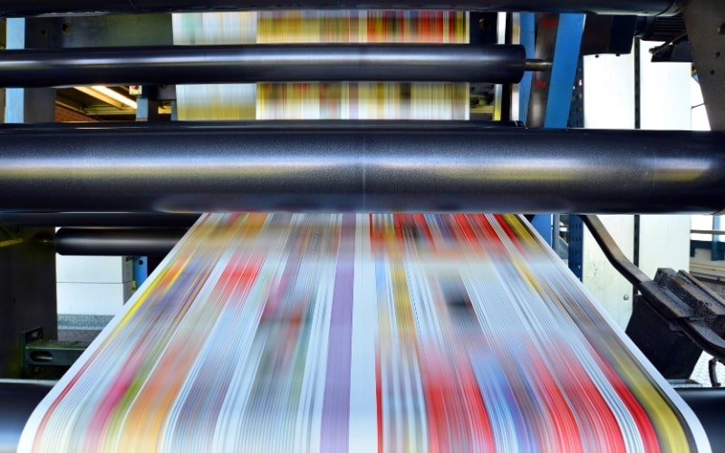
The process of printing and material selection is a crucial aspect of poster design that can significantly impact the final product’s appearance and effectiveness. Making the right choices ensures that your poster not only looks great but also stands the test of time and achieves its intended purpose. This section explores various printing techniques, paper types, finishes, and practical tips for selecting the best materials for your poster design.
Understanding Printing Techniques
Choosing the appropriate printing technique is vital to achieving the desired quality and effect for your poster. Here are some common printing methods:
Digital Printing:
- Pros: Cost-effective for small print runs, quick turnaround time, suitable for complex and colorful designs.
- Cons: Limited options for specialty inks and finishes compared to offset printing.
- Best For: Short runs, customized prints, event posters, and vibrant designs.
Offset Printing:
- Pros: High-quality results, cost-effective for large print runs, wide range of paper and finish options.
- Cons: Longer setup time, not ideal for small quantities.
- Best For: Large quantities, professional prints, posters requiring precise color matching and high detail.
Screen Printing:
- Pros: Durable prints, vibrant colors, excellent for large formats and specialty inks (e.g., metallic, fluorescent).
- Cons: Not cost-effective for small quantities, limited to simpler designs with fewer colors.
- Best For: Large posters, limited color designs, artistic prints.
Large Format Printing:
- Pros: Suitable for oversized prints, high-quality output, versatile materials (e.g., vinyl, canvas).
- Cons: Can be expensive, requires specialized equipment.
- Best For: Billboards, banners, exhibition posters.
Choosing the Right Paper
The choice of paper can dramatically influence the look and feel of your poster. Consider the following factors when selecting paper:
Weight and Thickness:
- Lightweight Paper: (70-100 gsm) is suitable for indoor posters and temporary displays. It’s cost-effective but can be prone to damage.
- Medium Weight Paper: (120-170 gsm) offers a good balance between durability and cost, ideal for most standard posters.
- Heavyweight Paper: (200+ gsm) is durable and gives a premium feel, perfect for high-quality prints and outdoor posters.
Finish:
- Matte Finish: Provides a non-reflective surface, ideal for readability and a sophisticated look. Great for text-heavy posters.
- Gloss Finish: Offers a shiny, reflective surface that enhances colors and images. Best for vibrant, image-heavy designs.
- Satin/Silk Finish: Strikes a balance between matte and gloss, offering a subtle sheen and good readability.
Texture:
- Smooth Paper: Provides a clean and professional look, suitable for detailed and high-resolution images.
- Textured Paper: Adds a tactile element to the poster, enhancing the aesthetic appeal. Great for artistic and high-end designs.
Durability:
- Consider coated papers for added durability, especially for outdoor posters. Coatings can protect against moisture, UV rays, and physical wear.
Special Finishes and Treatments
Adding special finishes can elevate the quality and impact of your poster. Here are some options to consider:
- Lamination: Adds a protective layer, making the poster more durable and resistant to damage. Available in gloss, matte, or satin finishes.
- UV Coating: Provides a high-gloss finish that enhances color vibrancy and protects against UV damage. Suitable for outdoor use.
- Spot UV: Applies a UV coating to specific areas of the poster, creating contrast and highlighting key elements. Adds a touch of sophistication.
- Embossing/Debossing: Creates a raised or recessed effect, adding a tactile dimension to the design. Ideal for logos and important text elements.
- Foil Stamping: Adds metallic accents using a foil layer, creating a luxurious and eye-catching effect. Perfect for high-end and artistic posters.
Practical Tips for Printing and Material Selection
- Consult with Printers: Work closely with professional printers to understand the best options for your design. They can provide samples and advice on paper types, finishes, and printing techniques.
- Proofing: Always request a proof before the final print run. This allows you to check colors, alignment, and overall quality, ensuring there are no surprises in the final product.
- Consider the Viewing Environment: Think about where the poster will be displayed. For outdoor posters, choose durable, weather-resistant materials. For indoor posters, consider lighting and space to select the appropriate finish and paper type.
- Budget Constraints: Balance quality with budget. While high-end materials and finishes can significantly enhance a poster, they can also increase costs. Determine which elements are essential for your design and where you can compromise.
- Sustainability: Consider eco-friendly options such as recycled paper and soy-based inks. Many printers offer sustainable printing solutions that minimize environmental impact.
- Design for Print: Ensure your design is print-ready. Use high-resolution images (300 dpi or higher), appropriate color modes (CMYK for print), and include bleed and crop marks to avoid trimming issues.
- Distribution and Handling: Think about how the posters will be transported and handled. Choose materials that can withstand folding or rolling if necessary, and consider protective packaging for shipping.
Examples of Effective Printing and Material Use
- Event Posters: A concert poster printed using offset printing on medium weight gloss paper, with spot UV coating on the band’s name to create a focal point.
- Promotional Posters: A product launch poster using digital printing on heavy matte paper, with foil stamping on the product logo for a luxurious feel.
- Artistic Posters: An art exhibition poster screen printed on textured paper, with embossing on the artist’s name to add a tactile element.
- Educational Posters: A museum exhibit poster printed using large format printing on satin finish paper, ensuring durability and readability under various lighting conditions.
Conclusion
In poster design, the harmony of visual elements, thoughtful typography, effective use of color and contrast, and the strategic incorporation of imagery all contribute to a compelling final product. By utilizing grids and layout principles, designers can create structured, visually appealing posters. The right printing techniques and material selection further enhance the quality and durability of the design. Whether you are promoting an event, educating an audience, or showcasing art, these principles ensure your poster captures attention and communicates your message effectively.
For more insights on enhancing your online presence and driving traffic to your website, read more on the other reasons why your website isn’t getting traffic. By integrating these design principles with a strong online strategy, you can maximize the impact of your promotional efforts both online and offline.