
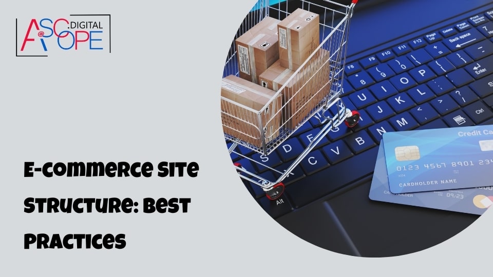
Understanding the Importance of E-commerce Site Structure
In the fast-paced world of online retail, the structure of an e-commerce site plays a pivotal role in its success. A well-structured e-commerce site not only enhances user experience but also significantly boosts search engine optimization (SEO). This dual benefit makes understanding and implementing effective site structure essential for any online business.
User Experience and Site Navigation
The primary function of a well-organized site structure is to facilitate easy navigation for users. When visitors land on your e-commerce site, they should be able to find what they are looking for with minimal effort. A clear and intuitive site structure helps guide users through the shopping process, from browsing products to completing a purchase. This seamless navigation is crucial for reducing bounce rates and increasing conversions.
Consider the frustration of a potential customer who cannot find the category or product they are interested in. This confusion often leads to abandoned carts and lost sales. Conversely, a site with a logical and well-organized structure encourages users to explore more pages, spend more time on the site, and ultimately make a purchase. Therefore, investing time and effort into planning your site structure can have a direct impact on your bottom line.
SEO Benefits of a Well-Structured Site
From an SEO perspective, a well-structured e-commerce site helps search engines understand and index your content more effectively. Search engines like Google use bots to crawl websites and gather information about their content. A clear and logical site structure makes it easier for these bots to navigate your site, understand its hierarchy, and index your pages accurately.
A well-structured site allows you to organize your content into categories and subcategories, creating a clear path for search engine bots to follow. This hierarchy not only helps search engines understand the relationship between different pages but also allows you to target specific keywords more effectively. For example, having dedicated category pages optimized for relevant keywords can improve your chances of ranking higher in search engine results for those terms.
Additionally, a well-structured site often results in better internal linking. Internal links are hyperlinks that connect one page of your site to another. They help distribute page authority and ranking power throughout your site, which can improve the SEO performance of individual pages. By strategically placing internal links, you can guide search engine bots to important pages and ensure that all your content gets indexed.
Reducing Duplicate Content Issues
Duplicate content is a common issue in e-commerce sites, especially those with large inventories. When the same or similar content appears on multiple pages, search engines may struggle to determine which page to rank, leading to lower rankings for all affected pages. A well-structured site helps mitigate this problem by organizing products and categories in a way that minimizes redundancy.
Using canonical tags is one way to address duplicate content issues. A canonical tag tells search engines which version of a page is the original or preferred one, thereby preventing duplicate content penalties. Ensuring that your site structure supports the proper use of canonical tags can safeguard your SEO efforts.
Enhancing Site Speed and Performance
Site speed is another critical factor influenced by site structure. A well-organized site can reduce the number of server requests and improve load times. Faster-loading pages provide a better user experience and are favored by search engines, which consider site speed when ranking pages.
To enhance site speed, ensure that your site structure minimizes the use of excessive redirects and optimizes media files. A streamlined structure also helps in efficient caching and content delivery, further boosting site performance.
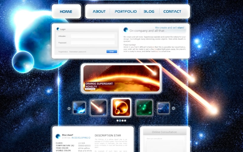
Creating a Clear and Intuitive Navigation Menu

A clear and intuitive navigation menu is the backbone of any successful e-commerce website. It serves as the primary tool for guiding visitors to the products and information they seek, thereby enhancing the user experience and driving conversions. In this section, we will delve into the importance of navigation menus, explore best practices for designing them, and discuss their impact on SEO.
The Importance of a Well-Designed Navigation Menu
The navigation menu is often the first point of interaction for users when they arrive at an e-commerce site. A well-designed menu helps users quickly find what they are looking for, reducing frustration and improving overall satisfaction. This ease of use is crucial for keeping visitors on your site longer and encouraging them to explore more pages.
From a business perspective, an intuitive navigation menu can significantly boost conversion rates. When users can easily navigate to product categories, special offers, and checkout pages, they are more likely to complete purchases. On the other hand, a confusing or cluttered menu can lead to high bounce rates and abandoned shopping carts, negatively impacting sales.
Best Practices for Designing Navigation Menus
Simplicity and Clarity
- Keep It Simple: Avoid overloading the menu with too many options. Aim for a balance where users have enough choices to find what they need but not so many that it becomes overwhelming.
- Use Clear Labels: Ensure that menu labels are clear and descriptive. Avoid jargon or overly creative names that might confuse users. For example, instead of “Apparel,” use “Clothing.”
Logical Hierarchy
- Organize Categories Logically: Group related items together and follow a logical hierarchy. For instance, under a main category like “Clothing,” you can have subcategories such as “Men,” “Women,” and “Children.”
- Prioritize Important Links: Place the most important categories and pages at the top of the menu or in prominent positions. This helps guide users to key areas of the site.
Responsive Design
- Ensure Mobile-Friendliness: With a significant portion of e-commerce traffic coming from mobile devices, it’s essential to have a navigation menu that works seamlessly on smaller screens. Consider using hamburger menus or collapsible categories to save space.
- Touch-Friendly Elements: Ensure that menu items are easily clickable on touchscreens. Buttons and links should be large enough to tap without difficulty.
Visual Design
- Consistent Style: Maintain a consistent design style for the navigation menu that aligns with your overall site aesthetics. This includes using consistent colors, fonts, and spacing.
- Highlight Active Pages: Use visual cues to indicate the current page or section. This helps users understand where they are within the site’s structure.
Search Functionality
- Include a Search Bar: For larger e-commerce sites with extensive product ranges, incorporating a search bar within or near the navigation menu can be incredibly helpful. This allows users to quickly find specific items without navigating through multiple categories.
User Testing and Feedback
- Conduct Usability Testing: Regularly test your navigation menu with real users to identify any pain points or areas for improvement. A/B testing different menu designs can provide valuable insights into what works best for your audience.
- Gather User Feedback: Encourage users to provide feedback on their navigation experience. This can reveal hidden issues and help you make informed adjustments.
The SEO Impact of Navigation Menus
A clear and intuitive navigation menu is not only beneficial for users but also for search engines. Here’s how:
Improved Crawlability
- Easier Crawling for Search Engines: A well-structured navigation menu helps search engine bots crawl and index your site more effectively. When bots can easily access all pages, it improves the likelihood of your content appearing in search results.
Enhanced User Engagement
- Lower Bounce Rates: When users find your site easy to navigate, they are more likely to stay longer and explore more pages. This increased engagement can positively influence your site’s ranking, as search engines consider user behavior metrics in their algorithms.
Better Link Equity Distribution
- Internal Linking Structure: A logical navigation menu helps distribute link equity across your site. By linking to important pages from the menu, you ensure that these pages receive sufficient internal links, which can boost their SEO performance.
Keyword Optimization
- Strategic Use of Keywords: Incorporate relevant keywords into your navigation menu labels where appropriate. However, avoid keyword stuffing, as this can harm the user experience and potentially lead to search engine penalties.
Implementing a Logical URL Structure

A logical URL structure is a cornerstone of effective e-commerce site design. It not only enhances user experience but also plays a crucial role in search engine optimization (SEO). By ensuring that your URLs are clean, descriptive, and well-organized, you can improve both your site’s usability and its visibility in search engine results. This section will explore the importance of a logical URL structure, best practices for implementation, and the SEO benefits it brings.
Importance of a Logical URL Structure
A well-structured URL system serves multiple purposes:
User Experience
- Ease of Navigation: Clear and descriptive URLs help users understand the hierarchy and structure of your site. For example, a URL like
www.example.com/clothing/men/shirtsimmediately tells the user where they are within the site and what to expect on the page. - Trust and Credibility: Users are more likely to trust and click on URLs that are clean and descriptive. A URL that looks organized and professional can instill confidence in potential customers.
SEO Benefits
- Search Engine Crawling: Search engines use URLs to crawl and index your site. A logical URL structure makes it easier for search engine bots to understand the context and relevance of each page, which can improve your site’s overall search visibility.
- Keyword Usage: Including relevant keywords in your URLs can help improve your rankings for those terms. However, it’s important to use keywords naturally and avoid overstuffing.
Link Sharing and Social Media
- Shareability: Clean URLs are more likely to be shared by users on social media and other platforms. A URL like
www.example.com/new-arrivals/summer-collectionis more appealing and easier to share thanwww.example.com/page?id=12345. - Memorability: Descriptive URLs are easier to remember, which can encourage repeat visits and direct traffic.
Best Practices for Implementing a Logical URL Structure
Keep It Simple and Descriptive
- Avoid Unnecessary Parameters: URLs should be straightforward and free of unnecessary characters or parameters. For example, use
www.example.com/products/shoesinstead ofwww.example.com/index.php?id=products&category=shoes. - Use Readable Words: URLs should be composed of readable words rather than random strings of characters. This not only helps users but also search engines understand the content of the page.
Use Hyphens to Separate Words
- Hyphens vs. Underscores: Use hyphens to separate words in a URL (
www.example.com/red-shoes) rather than underscores (www.example.com/red_shoes). Search engines treat hyphens as spaces, improving readability and SEO.
Incorporate Keywords Wisely
- Relevance and Context: Include relevant keywords in your URLs to improve SEO. Ensure the keywords are directly related to the content of the page and do not overuse them.
- Avoid Keyword Stuffing: Overloading your URL with keywords can appear spammy and hurt your SEO. Aim for a natural inclusion that enhances the URL’s descriptive nature.
Maintain Consistent Structure
- Hierarchical Organization: Organize your URLs to reflect the hierarchy of your site. For instance,
www.example.com/clothing/men/shirtsindicates that “shirts” is a subcategory under “men” in the “clothing” category. - Consistent Naming Conventions: Use consistent naming conventions across your site. Decide on a format for your URLs early on and stick to it to avoid confusion and maintain uniformity.
Avoid Dynamic and Duplicate URLs
- Static vs. Dynamic URLs: Prefer static URLs (which do not change) over dynamic ones (which can include parameters and session IDs). Static URLs are more user-friendly and SEO-friendly.
- Canonical Tags: Use canonical tags to prevent duplicate content issues if multiple URLs point to the same page. This helps search engines understand which version of the URL to index.
Implement 301 Redirects for URL Changes
- Preserve Link Equity: When changing URLs, use 301 redirects to direct traffic from the old URL to the new one. This preserves the SEO value and ensures users do not encounter broken links.
Monitor and Test URL Performance
- Regular Audits: Conduct regular audits of your URL structure to identify and fix issues. Tools like Google Search Console can help monitor how your URLs are performing and if there are any crawl errors.
- User Testing: Gather feedback from users on the navigability and clarity of your URL structure. This can provide insights into how real users interact with your site and where improvements can be made.
SEO Benefits of a Logical URL Structure
Improved Crawling and Indexing
- Enhanced Discoverability: A logical URL structure makes it easier for search engines to crawl and index your site. This ensures that all your important pages are discovered and ranked appropriately.
- Sitemaps: Creating and submitting an XML sitemap that reflects your URL structure can further aid search engines in indexing your site efficiently.
Higher Click-Through Rates (CTR)
- Descriptive URLs: URLs that accurately describe the content of the page can improve click-through rates from search engine results. Users are more likely to click on a link if they know exactly what to expect.
Better User Experience
- Reduced Bounce Rates: A clear URL structure helps users find relevant content quickly, reducing the likelihood of them leaving your site prematurely. This improved user experience can lead to lower bounce rates and higher engagement metrics, which are positive signals to search engines.
Effective Use of Internal Links
- Link Equity Distribution: A logical URL structure supports effective internal linking, which helps distribute link equity throughout your site. This can enhance the authority of your internal pages and improve their search rankings.
Optimizing Category and Product Pages

Optimizing category and product pages is crucial for the success of any e-commerce website. These pages serve as the primary touchpoints for customers searching for products, and their optimization can significantly impact both user experience and search engine rankings. In this section, we will explore the best practices for optimizing category and product pages, ensuring they are both user-friendly and SEO-optimized.
Importance of Optimizing Category and Product Pages
Category and product pages are where conversions happen. They are the final steps in a user’s journey from browsing to purchasing. Well-optimized pages not only improve the likelihood of conversions but also enhance the overall shopping experience, making it easier for customers to find and buy products. Additionally, optimized pages rank higher in search engine results, driving more organic traffic to your site.
Best Practices for Optimizing Category Pages
Clear and Descriptive Category Titles
- Use Relevant Keywords: Incorporate relevant keywords naturally into your category titles. This helps search engines understand the content of the page and improves rankings for those terms. For example, instead of a generic title like “Products,” use something more specific like “Men’s Running Shoes.”
- Be Descriptive: Ensure that your category titles accurately describe the products within the category. This helps users quickly identify if they are in the right place.
SEO-Friendly Category Descriptions
- Include Keywords: Write unique, keyword-rich descriptions for each category. This not only helps with SEO but also provides users with valuable information about the category.
- Engage Users: Make your descriptions engaging and informative. Explain what products are available in the category and highlight any special features or benefits.
High-Quality Images and Media
- Use High-Resolution Images: Ensure that category pages feature high-quality images that accurately represent the products. Images should be clear, well-lit, and professional.
- Incorporate Videos: Where possible, include videos that showcase the products in action. This can enhance user engagement and provide a better understanding of the products.
User-Friendly Navigation and Filters
- Implement Filters and Sorting Options: Provide users with filtering and sorting options to help them find products quickly. Filters could include size, color, price range, and brand.
- Ensure Easy Navigation: Make sure that users can easily navigate between categories and subcategories. A breadcrumb trail can be very helpful in this regard.
Internal Linking
- Link to Relevant Subcategories and Products: Use internal links to guide users to related categories and products. This not only helps users navigate your site but also improves SEO by spreading link equity.
Mobile Optimization
- Responsive Design: Ensure that your category pages are fully optimized for mobile devices. A significant portion of e-commerce traffic comes from mobile users, and a poor mobile experience can lead to high bounce rates.
- Fast Loading Times: Optimize images and other media to ensure that category pages load quickly on all devices.
Best Practices for Optimizing Product Pages
Compelling Product Titles
- Include Keywords: Just like with category titles, ensure that your product titles include relevant keywords. For example, “Red Women’s Running Shoes” is more effective than just “Running Shoes.”
- Be Specific: Provide specific details in the title, such as brand, model, and key features.
Detailed Product Descriptions
- Use Unique Descriptions: Avoid using manufacturer-provided descriptions verbatim. Write unique, detailed descriptions that highlight the product’s features, benefits, and uses.
- Incorporate Keywords Naturally: Include relevant keywords throughout the description, but ensure that the text reads naturally and is informative.
High-Quality Images and Videos
- Multiple Angles: Provide multiple high-resolution images showing the product from different angles. This helps customers get a better understanding of the product.
- Product Videos: If possible, include videos that demonstrate the product’s features and benefits. Videos can significantly enhance user engagement and conversion rates.
Customer Reviews and Ratings
- Encourage Reviews: Actively encourage customers to leave reviews and ratings. Positive reviews build trust and can significantly influence purchasing decisions.
- Respond to Reviews: Respond to both positive and negative reviews. This shows that you value customer feedback and are committed to improving the customer experience.
Clear Call-to-Actions (CTAs)
- Prominent Add to Cart Button: Make sure the “Add to Cart” button is prominent and easily accessible. It should stand out on the page to encourage conversions.
- Additional CTAs: Include other relevant CTAs, such as “Add to Wishlist,” “Compare,” and “Share.”
Technical SEO Elements
- Optimize Meta Tags: Ensure that each product page has a unique and descriptive meta title and meta description. These elements should include relevant keywords and be compelling enough to encourage clicks from search engine results.
- Use Schema Markup: Implement schema markup (structured data) to provide search engines with additional information about your products. This can enhance search result listings with rich snippets, such as star ratings and prices.
Mobile Optimization
- Responsive Product Pages: Ensure that product pages are fully optimized for mobile devices. This includes having a responsive design and ensuring that all elements (images, videos, buttons) are easily accessible on smaller screens.
- Fast Loading Times: Optimize all media and scripts to ensure that product pages load quickly on mobile devices.
Using Breadcrumbs for Better Navigation
Breadcrumbs are an often-overlooked yet highly effective navigational aid in e-commerce websites. They provide users with a clear pathway back to previously visited pages and a visual representation of the site’s structure, enhancing both user experience and SEO. In this section, we will explore the importance of breadcrumbs, the different types of breadcrumbs, best practices for implementation, and their benefits for navigation and SEO.
Importance of Breadcrumbs
Breadcrumbs serve multiple critical functions on an e-commerce site:
Enhanced User Experience
- Simplified Navigation: Breadcrumbs help users understand their current location within the site’s hierarchy. This makes it easier for them to backtrack to previous categories or pages without having to rely on the browser’s back button.
- Reduced Frustration: When users can easily navigate back to broader categories, they are less likely to feel lost or frustrated, which can reduce bounce rates and encourage longer site visits.
Improved SEO
- Better Crawlability: Breadcrumbs provide search engines with an additional layer of context about the site’s structure. This helps search engines crawl and index the site more effectively.
- Rich Snippets: Breadcrumbs can appear in search engine results as part of rich snippets, providing users with a clear sense of where the page fits within the site. This can improve click-through rates (CTR) from search results.
Increased Engagement
- Encourages Exploration: Breadcrumbs can encourage users to explore other sections of the site by providing easy access to related categories. This can lead to increased page views and higher engagement.
Types of Breadcrumbs
There are three primary types of breadcrumbs used in e-commerce sites:
Location-Based Breadcrumbs
- Hierarchy Representation: These breadcrumbs represent the user’s location within the site’s hierarchy. For example,
Home > Clothing > Men > Shirts. They are the most common type and are particularly useful for sites with a deep category structure. - User Path Clarity: They provide a clear path back to higher-level categories, making it easy for users to understand where they are and how to navigate back.
Attribute-Based Breadcrumbs
- Filtering Path: These breadcrumbs show the attributes or filters applied to reach the current page. For instance,
Home > Shoes > Color: Red > Size: 10. They are useful for sites with extensive filtering options. - Refinement Path: They help users understand the filtering or refinement path they have taken to reach the current product listing.
History-Based Breadcrumbs
- User Journey Representation: These breadcrumbs display the user’s actual navigation path, such as
Home > Previous Page > Current Page. They are less common but can be useful for users who want to retrace their exact steps. - Backtracking Aid: They provide a way for users to backtrack through their browsing history without using the browser’s back button.
Best Practices for Implementing Breadcrumbs
Consistency and Clarity
- Uniform Placement: Place breadcrumbs consistently across all pages, typically at the top of the page, below the main navigation bar. This ensures users know where to look for them.
- Clear Labels: Use clear and concise labels for each breadcrumb link. Avoid using jargon or overly creative names that may confuse users.
Clickable Links
- Interactive Elements: Ensure that each element in the breadcrumb trail, except for the current page, is clickable. This allows users to easily navigate back to any previous level.
- Highlight Current Page: Use a different style (such as bold text or a different color) for the current page to distinguish it from the other links.
Responsive Design
- Mobile Optimization: Ensure that breadcrumbs are fully responsive and work well on mobile devices. This may involve using shorter labels or collapsing long breadcrumb trails into a dropdown menu.
- Touch-Friendly: Make sure that breadcrumb links are large enough to be easily tapped on touchscreens.
Schema Markup
- Structured Data: Implement schema markup (structured data) for breadcrumbs to help search engines understand and display breadcrumb trails in search results. This can enhance your site’s appearance in SERPs and improve click-through rates.
SEO-Friendly URLs
- Descriptive Links: Ensure that the URLs linked in breadcrumbs are descriptive and include relevant keywords. This helps both users and search engines understand the context of each breadcrumb.
Accessibility Considerations
- Screen Reader Compatibility: Ensure that breadcrumbs are accessible to screen readers. Use appropriate ARIA (Accessible Rich Internet Applications) labels and roles to make the breadcrumb navigation clear for visually impaired users.
- Keyboard Navigation: Make sure that breadcrumbs can be navigated using a keyboard, enhancing usability for those who rely on keyboard navigation.
Benefits of Breadcrumbs for Navigation and SEO
Enhanced User Navigation
- Quick Pathfinding: Breadcrumbs provide users with a quick and easy way to navigate back to higher-level categories or previous pages, improving overall site usability.
- Reduced Bounce Rates: By offering a clear path for navigation, breadcrumbs can reduce bounce rates and keep users engaged on your site longer.
SEO Advantages
- Improved Crawlability: Breadcrumbs help search engines better understand the structure of your site, leading to more efficient crawling and indexing.
- Rich Snippets in SERPs: Breadcrumbs can appear in search engine results as part of rich snippets, providing users with more context about the page and potentially increasing click-through rates.
Increased User Engagement
- Encourages Exploration: Breadcrumbs encourage users to explore other parts of your site by providing easy access to related categories. This can lead to increased page views and higher engagement.
- Path Clarity: By clearly indicating the path to the current page, breadcrumbs help users feel more in control of their navigation, enhancing their overall experience.
Leveraging Internal Linking Strategies
Internal linking is a crucial aspect of SEO and user experience that involves creating hyperlinks within your website that point to other pages on the same site. Properly leveraging internal linking strategies can enhance your e-commerce site’s navigation, distribute page authority, and improve user engagement. In this section, we will delve into the importance of internal linking, best practices, and the various benefits it brings to an e-commerce website.
Importance of Internal Linking
Internal linking serves multiple purposes that are vital for the success of an e-commerce site:
Improved Navigation
- User Pathways: Internal links help users navigate through your site more easily by providing pathways to related content, products, or categories. This enhances the overall user experience and keeps visitors engaged.
- Reduced Bounce Rates: By offering users multiple pathways to explore, internal links can reduce bounce rates and encourage users to spend more time on your site.
Enhanced SEO
- Crawlability: Internal links help search engine bots crawl and index your site more efficiently. They provide a clear map of your site’s structure, ensuring all important pages are discovered.
- Page Authority Distribution: Internal links distribute page authority (link juice) across your site, helping to boost the SEO performance of linked pages.
User Engagement and Conversion
- Related Content Discovery: Internal links can guide users to related products or content, increasing the chances of additional purchases or engagement.
- Call-to-Action Support: Strategically placed internal links can lead users to important pages such as special offers, bestsellers, or checkout pages, supporting conversion goals.
Best Practices for Internal Linking
Use Descriptive Anchor Text
- Relevance and Context: Ensure that the anchor text used for internal links is descriptive and relevant to the linked page. This helps users and search engines understand the context of the link. For example, instead of using “click here,” use “men’s running shoes.”
- Natural Integration: Integrate internal links naturally within your content. Avoid forcing links into places where they don’t fit contextually.
Link to Deep Content
- Surface Important Pages: Don’t just link to your homepage or top-level category pages. Ensure that deep content, such as specific product pages or detailed blog posts, is also linked. This helps distribute authority more evenly across your site.
- Highlight High-Value Pages: Identify and link to high-value pages, such as those with high conversion rates or valuable content, to drive more traffic to these areas.
Maintain a Logical Structure
- Hierarchical Organization: Structure your internal links to reflect the hierarchy of your site. For example, link from category pages to subcategory pages, and from subcategory pages to product pages.
- Breadcrumbs and Related Links: Use breadcrumbs and related links to provide additional navigational aids. This helps users understand their location within the site and find related content easily.
Optimize for User Experience
- Avoid Overloading Pages: Don’t overload pages with too many internal links, as this can overwhelm users and dilute the value of individual links. Aim for a balanced approach.
- Ensure Mobile Friendliness: Ensure that internal links are easily clickable on mobile devices. This includes considering touch targets and the overall design of your mobile site.
Monitor and Update Links Regularly
- Fix Broken Links: Regularly check for and fix broken internal links. Broken links can frustrate users and negatively impact SEO.
- Update Anchor Text: Periodically review and update anchor text to ensure it remains relevant and descriptive. As your content evolves, so should your internal linking strategy.
Benefits of Internal Linking for SEO and User Engagement
Enhanced Crawlability and Indexing
- Efficient Bot Navigation: Internal links help search engine bots navigate your site more efficiently. This ensures that all important pages are crawled and indexed, improving overall SEO performance.
- Discovery of New Content: Regularly updated internal links can help search engines discover new or updated content more quickly, ensuring it gets indexed promptly.
Improved Page Authority Distribution
- Boosting Lower-Ranked Pages: Internal linking allows you to pass authority from high-ranking pages to lower-ranked pages, helping to improve their search engine visibility.
- Balanced Link Equity: By strategically linking to various pages, you can ensure a more balanced distribution of link equity across your site.
Increased User Engagement
- Guiding User Journeys: Internal links guide users through their journey on your site, encouraging them to explore more content and products. This can lead to higher engagement metrics such as time on site and pages per session.
- Supporting Conversion Paths: By linking to key conversion pages, such as product detail pages or special offers, you can direct users towards completing desired actions, thereby increasing conversion rates.
Better User Experience
- Reduced Frustration: Providing clear pathways through internal links reduces user frustration by helping them find relevant content quickly.
- Enhanced Navigation: Internal links enhance overall site navigation, making it easier for users to move between related content and products.
Implementing Internal Linking Strategies
Content Hubs and Pillar Pages
- Create Content Hubs: Develop content hubs or pillar pages that serve as comprehensive resources on specific topics. Link to these hubs from related articles and product pages to consolidate authority and guide users to in-depth information.
- Supportive Content: Surround your pillar pages with supportive content that links back to the hub, creating a network of related pages that enhances SEO and user navigation.
Cross-Linking Between Products and Blog Posts
- Product to Blog Links: Link from product pages to relevant blog posts that provide additional information, usage tips, or related content. This adds value for users and can improve product page rankings.
- Blog to Product Links: Within blog posts, link to relevant product pages to drive traffic and encourage conversions. For example, a blog post on “winter fashion tips” can link to winter clothing products.
Utilize Site Search Data
- Analyze Search Queries: Use site search data to identify commonly searched terms and products. Ensure these items are prominently linked within your internal linking strategy to meet user demand.
- Link Popular Searches: Create internal links to frequently searched products or categories, improving accessibility and user satisfaction.
Ensuring Mobile-Friendliness and Responsive Design

In today’s digital age, ensuring mobile-friendliness and responsive design is paramount for any e-commerce website. With a significant portion of online shopping done via mobile devices, a seamless mobile experience is crucial for user satisfaction, engagement, and conversions. This section will delve into the importance of mobile-friendliness, best practices for implementing responsive design, and the benefits these efforts bring to an e-commerce site.
Importance of Mobile-Friendliness
User Behavior
- Mobile Usage Trends: A substantial and growing percentage of online traffic comes from mobile devices. Ignoring this demographic means potentially losing a large segment of your audience.
- Shopping On-the-Go: Mobile devices allow users to shop anytime, anywhere. A mobile-friendly site caters to this convenience, enhancing the likelihood of conversions.
SEO Advantages
- Google’s Mobile-First Indexing: Google primarily uses the mobile version of a site for indexing and ranking. A non-mobile-friendly site can suffer in search engine rankings.
- Improved Rankings: Mobile-friendly sites often rank higher in search results, driving more organic traffic.
Enhanced User Experience
- Accessibility: A responsive design ensures that all users, regardless of their device, have access to a fully functional and visually appealing site.
- Reduced Bounce Rates: Users are likely to abandon sites that don’t provide a good mobile experience, leading to high bounce rates. A mobile-friendly site retains users and encourages engagement.
Best Practices for Implementing Responsive Design
Flexible Grid Layouts
- Fluid Grids: Use fluid grids that adjust according to the screen size. This ensures that your site looks good on any device, whether it’s a desktop, tablet, or smartphone.
- Proportional Units: Design using proportional units (percentages) instead of fixed units (pixels) to allow for dynamic resizing.
Scalable Images and Media
- Responsive Images: Ensure that images resize appropriately for different screen sizes. Use CSS techniques like max-width: 100% to make images flexible.
- Optimized Media: Use appropriate formats and compress images to reduce load times without sacrificing quality. Consider using responsive image techniques like srcset to serve different image sizes based on the user’s device.
Touch-Friendly Navigation
- Clickable Elements: Ensure that all clickable elements (buttons, links) are large enough and spaced adequately to be easily tapped on touchscreens.
- Simple Menus: Use simple, expandable menus (such as hamburger menus) for mobile navigation. This conserves screen space and enhances usability.
Typography and Readability
- Legible Fonts: Use readable fonts that scale well on different screen sizes. Avoid using too small or too fancy fonts that might be hard to read on smaller screens.
- Adequate Spacing: Ensure proper spacing between text elements to prevent clutter and enhance readability.
Performance Optimization
- Minimize HTTP Requests: Reduce the number of HTTP requests by combining files, using CSS sprites, and minimizing the use of plugins.
- Lazy Loading: Implement lazy loading for images and other media to improve initial load times, especially on mobile devices with slower internet connections.
- Use of CDNs: Employ Content Delivery Networks (CDNs) to ensure fast load times by serving content from servers closer to the user’s location.
Testing Across Devices
- Cross-Device Testing: Regularly test your site on various devices and screen sizes to ensure a consistent and functional experience across all platforms.
- User Feedback: Gather feedback from real users about their mobile experience to identify and address potential issues.
Mobile-Specific Features
- Click-to-Call Buttons: For sites that include contact options, use click-to-call buttons to make it easy for users to contact you directly from their mobile devices.
- Location-Based Services: Implement location-based features like store locators or localized promotions to cater to mobile users.
Benefits of Mobile-Friendliness and Responsive Design
Increased User Engagement
- Positive User Experience: A seamless mobile experience encourages users to spend more time on your site, exploring products and engaging with content.
- Higher Conversion Rates: Mobile-friendly sites often see higher conversion rates as users find it easier to browse, select, and purchase products.
Better SEO Performance
- Higher Rankings: Google’s mobile-first indexing favors mobile-optimized sites, leading to higher search rankings and increased organic traffic.
- Lower Bounce Rates: A responsive design reduces bounce rates, a factor that search engines consider when ranking sites.
Competitive Advantage
- Meeting User Expectations: With mobile shopping becoming the norm, users expect a seamless mobile experience. Providing this can set you apart from competitors who may not be as mobile-friendly.
- Brand Perception: A well-designed mobile site enhances brand perception, portraying your business as modern, user-centric, and reliable.
Cost Efficiency
- Single Site Maintenance: Maintaining a single responsive site is more cost-effective than managing separate desktop and mobile sites. Updates and changes need to be made only once, saving time and resources.
- Future-Proofing: Responsive design ensures your site is prepared for future devices and screen sizes, making it a sustainable long-term solution.
Implementing Mobile-Friendliness and Responsive Design
Adopt a Mobile-First Approach
- Design for Mobile First: Start by designing for the smallest screen and progressively enhance the design for larger screens. This ensures a solid mobile experience from the outset.
- Prioritize Content: Identify the most crucial content and features for mobile users and prioritize their display.
Use Responsive Design Frameworks
- CSS Frameworks: Utilize responsive design frameworks like Bootstrap or Foundation to streamline the development process and ensure consistency across devices.
- Media Queries: Employ CSS media queries to apply different styles based on the device’s screen size, orientation, and resolution.
Monitor Performance and Analytics
- Regular Audits: Conduct regular performance audits to identify and resolve issues affecting mobile users. Tools like Google PageSpeed Insights can provide valuable insights.
- Track Mobile Metrics: Use analytics to track mobile-specific metrics such as mobile traffic, bounce rates, and conversion rates. This data can inform ongoing optimization efforts.
Conclusion
Ensuring mobile-friendliness and implementing responsive design are essential for the success of any e-commerce website. These practices not only enhance user satisfaction and drive conversions but also boost SEO performance and provide a competitive edge. By following best practices such as using flexible grid layouts, scalable images, touch-friendly navigation, and performance optimization, you can create a seamless mobile experience that meets the needs of today’s shoppers. Investing in mobile-friendliness is crucial for staying relevant and competitive in the digital marketplace. Read more on the other reasons why your website isn’t getting traffic.