
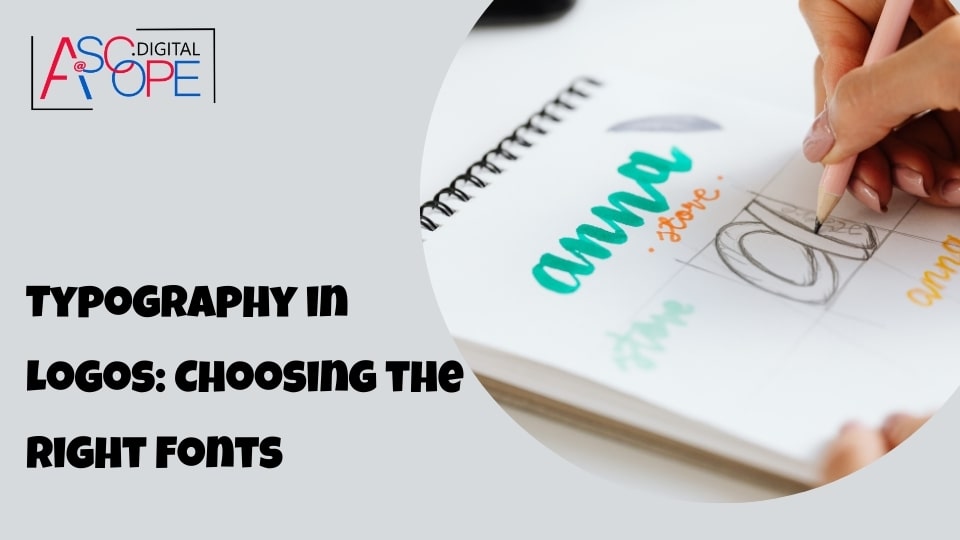
Typography plays a crucial role in logo design, serving as a fundamental element that can influence how a brand is perceived by its audience. A well-chosen typeface can convey the brand’s personality, values, and message effectively, making it a critical aspect of creating a memorable and impactful logo. In this section, we will explore the significance of typography in logo design, its various elements, and how it can enhance brand identity.
The Role of Typography in Branding
Typography is more than just selecting a font; it is about choosing a typeface that resonates with the brand’s identity and communicates its message clearly. The font used in a logo can evoke specific emotions and associations, influencing how the brand is perceived. For instance, a modern sans-serif font can convey a sense of innovation and forward-thinking, while a classic serif font might evoke feelings of tradition and reliability. The choice of typography can set the tone for the entire brand, making it essential to select a typeface that aligns with the brand’s ethos and target audience.
Conveying Brand Personality
The right typography can encapsulate a brand’s personality, whether it is playful, professional, luxurious, or approachable. For example, a tech company might opt for a clean, minimalist typeface to reflect its focus on innovation and cutting-edge technology. In contrast, a handmade crafts business might choose a more whimsical and decorative font to convey creativity and artisanal quality. Understanding the brand’s core attributes and how they should be represented visually is key to selecting typography that enhances the logo design.
Enhancing Readability and Scalability
A logo must be legible at various sizes and across different mediums, from business cards to billboards. The typography chosen must maintain its readability and clarity regardless of size. This is where the design principles of readability and scalability come into play. Readability ensures that the text is easily distinguishable, while scalability guarantees that the logo remains clear and effective when resized. Selecting a typeface with clean lines and sufficient spacing can help maintain the logo’s integrity and impact across different applications.
Creating Visual Hierarchy
Typography helps establish a visual hierarchy within a logo, guiding the viewer’s eye and emphasizing the most critical elements. This is particularly important in logos that include both text and graphic elements. By varying the weight, size, and style of the typeface, designers can create a sense of hierarchy and ensure that the brand name or tagline stands out. For example, using a bold typeface for the brand name and a lighter, smaller font for the tagline can effectively direct attention to the primary brand identity.
Differentiating the Brand
In a crowded market, standing out is vital. Unique typography can differentiate a brand from its competitors and make it more memorable to consumers. Custom typefaces or modified fonts can give a logo a distinctive look that is hard to replicate, adding a layer of originality and uniqueness. Brands like Coca-Cola and Disney have distinctive typography that is instantly recognizable and synonymous with their identity, showcasing the power of unique typefaces in creating a lasting impression.
Consistency Across Brand Materials
Consistency in typography across all brand materials reinforces brand recognition and builds trust with the audience. The typeface used in the logo should be reflected in other branding elements, such as websites, packaging, and advertising, to create a cohesive brand image. This consistency ensures that the brand is easily recognizable and maintains a professional appearance across all touchpoints.
Psychological Impact of Typography
Different typefaces can evoke different psychological responses. For instance, rounded fonts can feel more friendly and approachable, while sharp, angular fonts can seem more dynamic and assertive. Understanding the psychological impact of typography can help designers choose a typeface that aligns with the desired brand perception. This nuanced approach to typography selection can significantly enhance the overall effectiveness of the logo and the brand’s communication strategy.
Types of Fonts: Serif, Sans-serif, Script, and Decorative
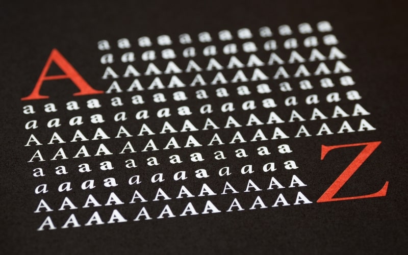
Typography is a critical aspect of logo design, influencing how a brand’s message is conveyed and perceived. The choice of font can communicate a brand’s personality, values, and style. Understanding the different types of fonts and their unique characteristics is essential for making informed design decisions. In this section, we will explore four primary font categories—serif, sans-serif, script, and decorative—and discuss their uses, benefits, and potential drawbacks in logo design.
Serif Fonts
Serif fonts are characterized by small lines or strokes attached to the end of larger strokes in a letter or symbol. These small lines are known as serifs. Common examples of serif fonts include Times New Roman, Georgia, and Garamond.
Advantages:
- Traditional and Professional Appearance: Serif fonts are often associated with tradition, reliability, and professionalism. This makes them suitable for industries like law, finance, and education.
- Readability: The serifs can help guide the eye along the text, improving readability, especially in print media.
- Timeless Appeal: Serif fonts have a classic, timeless quality that can give a logo a sense of enduring strength and stability.
Drawbacks:
- Scalability Issues: The intricate details of serif fonts can become less legible at smaller sizes, which can be problematic for logos that need to be scaled down significantly.
- Perceived Conservatism: While the traditional look of serif fonts can be a strength, it can also be a drawback for brands looking to project a modern, cutting-edge image.
Sans-serif Fonts
Sans-serif fonts lack the small projecting features called serifs at the end of strokes. Examples of sans-serif fonts include Arial, Helvetica, and Calibri.
Advantages:
- Modern and Clean: Sans-serif fonts are often perceived as modern, clean, and straightforward, making them popular for tech companies, startups, and contemporary brands.
- Versatility: These fonts are highly versatile and can work well across various digital and print media.
- Legibility: Sans-serif fonts tend to be more legible at smaller sizes and on screens, which is crucial for logos that will be used in diverse digital environments.
Drawbacks:
- Lack of Distinctiveness: The simplicity of sans-serif fonts can sometimes lead to a lack of distinctiveness, making it harder for a brand to stand out if not paired with other unique design elements.
- Less Formal: While this can be an advantage for some brands, the informal look of sans-serif fonts might not suit more traditional or formal industries.
Script Fonts
Script fonts mimic the fluid strokes of handwriting. They range from formal calligraphy styles to more casual and playful handwriting styles. Examples include Brush Script, Pacifico, and Lobster.
Advantages:
- Personal and Elegant: Script fonts can add a personal touch to a logo, making it feel more approachable and human. They can also evoke elegance and sophistication, suitable for luxury brands, weddings, and creative industries.
- Unique and Artistic: The variability in script fonts allows for a high degree of creativity and uniqueness, helping a logo to stand out.
Drawbacks:
- Legibility Issues: Script fonts can be difficult to read, especially at smaller sizes or when used in lengthy text. This can be a significant drawback for logos that need to be instantly recognizable.
- Formality Mismatch: The decorative nature of script fonts can be seen as overly elaborate or out of place in more straightforward, modern brand contexts.
Decorative Fonts
Decorative fonts, also known as display fonts, are highly stylized and designed to attract attention. They are often used sparingly for headlines, logos, and branding elements. Examples include Comic Sans, Jokerman, and Impact.
Advantages:
- Highly Distinctive: Decorative fonts can give a logo a highly distinctive and memorable look, helping a brand to stand out in a crowded market.
- Creative Freedom: These fonts offer extensive creative freedom, allowing designers to craft unique and eye-catching logos.
Drawbacks:
- Limited Use: Due to their highly stylized nature, decorative fonts can be overwhelming if overused. They are best used in moderation and for specific design elements rather than body text.
- Legibility Concerns: The intricate and unusual designs of decorative fonts can compromise readability, especially at smaller sizes.
Matching Typography to Brand Personality
In the world of logo design, typography is not just about selecting a typeface; it’s about choosing a font that resonates with a brand’s personality and effectively communicates its core values to the target audience. The right typography can encapsulate a brand’s essence, whether it’s playful, sophisticated, rugged, or elegant. This section delves into how to match typography to brand personality, highlighting key considerations and practical tips to ensure a harmonious and impactful design.
Understanding Brand Personality
Before selecting typography, it’s crucial to have a deep understanding of the brand’s personality. A brand personality can be described as the set of human characteristics attributed to a brand, influencing how it is perceived by the audience. Brands can be:
- Professional and Trustworthy: Often seen in financial institutions, law firms, and corporate entities.
- Fun and Playful: Common in children’s products, entertainment companies, and casual dining.
- Modern and Innovative: Frequently found in tech startups, fashion brands, and cutting-edge businesses.
- Elegant and Luxurious: Typical for high-end fashion, luxury goods, and premium services.
- Rugged and Robust: Associated with outdoor gear, construction, and automotive industries.
Each of these personalities can be expressed through specific typography choices, enhancing the overall brand message.
Professional and Trustworthy
For brands that aim to convey professionalism and trustworthiness, such as banks, law firms, or consulting companies, serif fonts are often the preferred choice. Serif fonts, like Times New Roman, Garamond, and Georgia, have a classic and traditional look that evokes stability and reliability.
Key Considerations:
- Clean Lines and Balanced Proportions: These characteristics enhance the perception of professionalism.
- Readability: Ensuring the font is legible at various sizes maintains the brand’s clarity and trustworthiness.
- Subtle Elegance: A touch of refinement can make the brand appear more established and dependable.
Fun and Playful
Brands that are fun and playful, such as those in the entertainment or children’s products sectors, benefit from using more whimsical and casual typefaces. Script fonts and rounded sans-serif fonts like Comic Sans, Pacifico, or Lobster can infuse a sense of joy and friendliness into the logo.
Key Considerations:
- Expressive and Dynamic: Fonts with personality and movement convey a sense of fun.
- Approachability: Rounded edges and informal styles make the brand feel more accessible and friendly.
- Vibrant and Eye-catching: Bold and colorful typography can attract attention and resonate with a younger audience.
Modern and Innovative
Tech startups, fashion brands, and companies that position themselves as forward-thinking and contemporary often use sans-serif fonts. Fonts like Helvetica, Arial, and Futura are popular choices for conveying a sleek, modern, and innovative brand personality.
Key Considerations:
- Minimalist Design: Clean and simple fonts emphasize modernity and sophistication.
- Versatility: Sans-serif fonts are adaptable and work well across digital and print media.
- Fresh and Cutting-edge: The latest font trends can keep the brand looking current and relevant.
Elegant and Luxurious
For high-end brands, typography must exude elegance and luxury. Script fonts, as well as sophisticated serif fonts like Didot or Bodoni, can elevate a brand’s image to reflect exclusivity and opulence.
Key Considerations:
- Refined and Stylish: Fonts with intricate details and fine lines add a touch of luxury.
- Sophistication: Elegant fonts convey high quality and exclusivity.
- Timeless Appeal: Choosing a font with classic beauty can enhance the brand’s longevity and prestige.
Rugged and Robust
Brands in the outdoor, construction, or automotive industries need typography that reflects strength and durability. Slab serif fonts and bold sans-serif fonts like Rockwell or Impact are ideal for these brands.
Key Considerations:
- Sturdy and Bold: Thick lines and solid shapes convey toughness and reliability.
- Masculine and Strong: Fonts with a strong presence resonate with a rugged brand personality.
- Legibility: Clear and straightforward fonts ensure the brand message is communicated effectively even in challenging environments.
Practical Tips for Matching Typography to Brand Personality
- Conduct Brand Research: Understand the brand’s mission, values, and target audience. This foundational knowledge guides typography selection.
- Consider the Medium: Ensure the chosen typeface is versatile and works well across all branding materials, including digital platforms and physical products.
- Test Readability: Always test the font at various sizes to ensure it remains legible and impactful.
- Stay Consistent: Use the selected typography consistently across all brand elements to reinforce brand recognition and cohesion.
- Get Feedback: Gather opinions from stakeholders and potential customers to see if the typography resonates with the intended brand personality.
Readability and Scalability: Key Considerations
When it comes to logo design, readability and scalability are paramount. A logo must communicate the brand’s message clearly and effectively, regardless of its size or the medium in which it is displayed. Ensuring that typography in a logo remains legible and impactful, whether it’s on a business card or a billboard, is crucial for maintaining brand integrity and recognition. This section explores the importance of readability and scalability in logo typography and provides key considerations for achieving optimal results.
Importance of Readability in Logo Design
Readability refers to how easily text can be read and understood. In logo design, this is essential because the primary goal is to make a strong and immediate impression. If the text in a logo is difficult to read, the brand’s message can be lost, leading to confusion and a lack of connection with the audience.
Key Aspects of Readability:
- Font Choice: Selecting a font that is inherently readable is the first step. Fonts with clear, distinct characters and appropriate spacing are generally more readable.
- Contrast: Ensuring there is sufficient contrast between the text and its background enhances readability. Dark text on a light background or vice versa typically works well.
- Simplicity: Overly decorative or complex fonts can hinder readability. Simplicity in typography often results in better legibility.
Importance of Scalability in Logo Design
Scalability refers to the ability of a logo to maintain its integrity and legibility at different sizes. A scalable logo looks good and is readable whether it is printed on a small promotional item or displayed on a large billboard. This versatility is essential for a consistent brand presence across various platforms and media.
Key Aspects of Scalability:
- Vector Graphics: Designing logos in vector formats (such as SVG or EPS) ensures they can be resized without loss of quality. Vector graphics are resolution-independent, making them ideal for scalability.
- Font Weight and Size: Choosing a font that retains its clarity and impact when scaled up or down is crucial. Fonts that are too thin may disappear at smaller sizes, while overly bold fonts can become overwhelming when enlarged.
- Simplified Design: A minimalistic design approach often enhances scalability. Logos with too many intricate details can lose their clarity when resized.
Balancing Readability and Scalability
Achieving the perfect balance between readability and scalability involves thoughtful design choices and thorough testing. Here are some key considerations to keep in mind:
- Test at Various Sizes:
- Regularly test the logo at different sizes during the design process. This practice helps identify potential readability issues early on.
- Create mock-ups of the logo on various media, such as business cards, websites, and large banners, to see how it performs.
- Use Appropriate Font Styles:
- Opt for fonts that are known for their readability and scalability. Sans-serif fonts, for example, are often more legible at smaller sizes compared to serif fonts.
- Avoid overly decorative fonts for the main text of the logo, as they can compromise both readability and scalability.
- Maintain Adequate Spacing:
- Ensure there is sufficient spacing between letters (kerning) and lines (leading) to enhance readability.
- Proper spacing also helps maintain the logo’s integrity when it is resized.
- Simplify the Design:
- Keep the design elements of the logo simple and avoid unnecessary complexity. Simplicity aids in both readability and scalability.
- Focus on strong, clear shapes and lines that can be easily recognized at a glance.
- Contrast and Color:
- Use high-contrast color combinations to enhance readability. Ensure the text stands out clearly against the background.
- Be mindful of how colors may appear differently in print and on screens, and test the logo in both scenarios.
- Consider Context and Medium:
- Think about where and how the logo will be used. A logo that works well on a website might need adjustments to be effective on printed materials.
- Adapt the logo for different contexts without losing its core identity.
Practical Examples
Apple’s Logo: Apple’s logo is a prime example of scalability and readability. The simple, clean apple shape with a bite taken out of it is instantly recognizable at any size. Its design maintains integrity and impact from tiny app icons to massive billboards.
Coca-Cola’s Logo: Coca-Cola’s script logo is highly readable and scalable despite its decorative font. The consistent use of red and white provides strong contrast, ensuring the logo stands out and remains legible.
Pairing Fonts: How to Create Harmonious Combinations

In logo design, pairing fonts effectively can elevate a brand’s visual identity, creating a harmonious and professional appearance. The right font combination can convey the brand’s message more effectively and enhance readability. This section explores the art of pairing fonts, discussing key principles, practical tips, and examples to help designers create cohesive and impactful logo designs.
The Importance of Font Pairing
Font pairing involves combining two or more typefaces that complement each other, enhancing the overall design and ensuring that the text elements work together harmoniously. Effective font pairing can:
- Enhance Readability: Properly paired fonts make text easier to read by creating a clear visual hierarchy.
- Convey Brand Personality: Different fonts can represent various aspects of a brand’s identity, making the logo more dynamic and expressive.
- Create Visual Interest: A well-executed font combination adds depth and interest to the design, making it more engaging.
Key Principles for Pairing Fonts
- Contrast and Complement:
- Contrast: Pair fonts with distinct characteristics to create a visual hierarchy. For example, combine a bold sans-serif with a delicate serif to differentiate headings from body text.
- Complement: Ensure the fonts share similar stylistic elements or moods to maintain coherence. For instance, both fonts might have a similar x-height or character width.
- Hierarchy and Balance:
- Establish a clear hierarchy by using different fonts for different purposes, such as one for the main logo text and another for the tagline. This helps guide the viewer’s eye and emphasizes key information.
- Balance the fonts to ensure neither dominates the design. Avoid using too many contrasting fonts, which can make the logo look cluttered and disjointed.
- Consistency and Cohesion:
- Maintain consistency in style and mood across all typefaces. If one font is modern and sleek, the paired font should not be overly traditional or ornate.
- Ensure the fonts work well together in various applications, from digital screens to print media.
Practical Tips for Pairing Fonts
- Start with a Primary Font:
- Choose a primary font that reflects the brand’s core attributes. This font will be the anchor for your design, setting the tone and style for the entire logo.
- Ensure the primary font is versatile and works well in different contexts and sizes.
- Select a Secondary Font:
- The secondary font should complement the primary font without overpowering it. Consider using a contrasting style, such as pairing a serif with a sans-serif, to create visual interest.
- Test the combination by placing the fonts together in various layouts to see how they interact.
- Use Font Pairing Tools:
- Online tools like Google Fonts, FontPair, and Typewolf can help you discover and test font combinations. These resources provide curated font pairings that are proven to work well together.
- Experiment with different pairings using these tools to find the perfect combination for your logo.
- Consider Legibility:
- Ensure both fonts are easily readable, especially at smaller sizes. Avoid overly decorative fonts that might compromise legibility.
- Test the fonts in different sizes and mediums to ensure they remain clear and legible.
- Maintain a Consistent Theme:
- Align the fonts with the overall theme and message of the brand. For example, a luxury brand might pair an elegant serif with a subtle sans-serif, while a tech startup might use modern, clean typefaces.
- Ensure the fonts support the brand’s identity and enhance its visual narrative.
Examples of Effective Font Pairing
- Classic and Modern:
- Primary Font: Times New Roman (Serif)
- Secondary Font: Arial (Sans-serif)
- Why It Works: The classic elegance of Times New Roman pairs well with the clean, modern lines of Arial, creating a balanced and professional look.
- Elegant and Minimalist:
- Primary Font: Playfair Display (Serif)
- Secondary Font: Lato (Sans-serif)
- Why It Works: Playfair Display’s sophisticated and stylish appearance complements Lato’s minimalistic and versatile nature, ideal for brands seeking a touch of elegance.
- Bold and Subtle:
- Primary Font: Montserrat (Sans-serif)
- Secondary Font: Open Sans (Sans-serif)
- Why It Works: Montserrat’s bold, geometric design contrasts nicely with Open Sans’s more subtle and humanistic style, making it perfect for modern and approachable brands.
Trends in Typography for Modern Logos

Typography is a crucial element of logo design, reflecting a brand’s identity and evolving alongside design trends. As brands strive to stay relevant and resonate with contemporary audiences, understanding and incorporating modern typography trends can be pivotal. This section explores the latest trends in typography for modern logos, providing insights into how designers can leverage these trends to create innovative and effective brand identities.
1. Minimalism and Simplicity
Trend Overview: Minimalism continues to dominate the design world, emphasizing clean, uncluttered aesthetics. In typography, this translates to simple, sans-serif fonts with clean lines and ample white space.
Why It Works:
- Clarity: Minimalist fonts enhance readability and ensure the brand’s name is easily recognized.
- Versatility: Simple typefaces adapt well across various media, from digital screens to print.
- Timelessness: Minimalist designs are less likely to look dated, providing longevity to the logo.
Examples:
- Brands like Google and Apple use minimalist typography, reflecting their modern, user-friendly brand identities.
2. Custom and Hand-Drawn Fonts
Trend Overview: Custom and hand-drawn fonts offer a unique, personalized touch to logos, helping brands stand out in a crowded market. These fonts can range from sophisticated calligraphy to playful, quirky designs.
Why It Works:
- Uniqueness: Custom fonts ensure the logo is one-of-a-kind, enhancing brand recognition.
- Personality: Hand-drawn elements add character and warmth, making the brand feel more approachable and human.
Examples:
- Coca-Cola’s script logo and Mailchimp’s quirky, hand-drawn typeface reflect the distinctive personalities of their brands.
3. Geometric Fonts
Trend Overview: Geometric fonts, characterized by precise, clean shapes, bring a sense of structure and modernity to logos. These fonts often use simple geometric forms like circles, squares, and triangles.
Why It Works:
- Modern Appeal: Geometric fonts convey a contemporary, forward-thinking brand image.
- Balance and Harmony: The structured nature of these fonts creates a visually pleasing balance in design.
Examples:
- Logos like those of Airbnb and Spotify utilize geometric fonts to project modernity and clarity.
4. Vintage and Retro Fonts
Trend Overview: Vintage and retro fonts evoke nostalgia, drawing inspiration from past design eras. These fonts often feature distinctive, ornate elements reminiscent of specific historical periods.
Why It Works:
- Emotional Connection: Retro fonts tap into nostalgia, evoking positive memories and emotions.
- Unique Style: Vintage typography stands out with its distinct, elaborate designs.
Examples:
- Brands like Hershey’s and Levi’s use vintage typography to emphasize their long-standing heritage and timeless quality.
5. Bold and Chunky Fonts
Trend Overview: Bold, chunky fonts make a strong statement, demanding attention and conveying confidence. These fonts are often used to create impactful, memorable logos.
Why It Works:
- Visibility: Bold fonts stand out, making the logo easily recognizable from a distance.
- Strength and Stability: The robustness of these fonts conveys a sense of reliability and strength.
Examples:
- Brands like FedEx and Netflix use bold typography to ensure their logos are prominent and easily identifiable.
6. Variable Fonts
Trend Overview: Variable fonts offer flexibility, allowing designers to adjust weight, width, and other attributes dynamically. This adaptability enables more creative and responsive logo designs.
Why It Works:
- Flexibility: Variable fonts can be customized to fit different contexts and media, enhancing versatility.
- Innovation: These fonts reflect a brand’s adaptability and forward-thinking approach.
Examples:
- Websites and apps increasingly use variable fonts for dynamic, responsive branding, although specific logo examples are still emerging.
7. Mixed Typography
Trend Overview: Mixing different typefaces within a single logo is becoming more popular, adding visual interest and contrast. This trend involves combining fonts of different styles, weights, and sizes.
Why It Works:
- Dynamism: Mixed typography creates a dynamic, eye-catching design that holds viewers’ attention.
- Versatility: Combining fonts allows for greater expression and differentiation within the logo.
Examples:
- Brands like Yahoo! and Duolingo use mixed typography to create lively, engaging logos.
Implementing Modern Typography Trends
Practical Tips:
- Know Your Brand: Understand your brand’s personality and values to choose a typography trend that aligns with your identity.
- Keep It Legible: Ensure readability remains a priority, regardless of the trend you choose.
- Stay Consistent: Maintain consistency in typography across all brand materials to reinforce brand recognition.
- Test Across Media: Check how the typography works in various contexts and sizes to ensure it retains its impact.
Case Studies: Successful Logos and Their Font Choices
Analyzing successful logos and their font choices provides valuable insights into how typography can enhance brand identity and communication. This section delves into several notable case studies of well-known brands, examining how their font choices contribute to their logo’s effectiveness and the brand’s overall success.
1. Coca-Cola: Classic Script for Timeless Appeal
Overview: The Coca-Cola logo is one of the most recognizable logos in the world, characterized by its flowing Spencerian script.
Font Choice:
- Script Font: The Spencerian script used in the Coca-Cola logo is elegant and intricate, evoking a sense of tradition and authenticity.
Impact:
- Timelessness: The cursive script has remained largely unchanged since its creation in the late 19th century, providing a sense of continuity and timelessness.
- Emotional Connection: The flowing, hand-written style of the font evokes a nostalgic feeling, connecting consumers to the brand’s rich history and heritage.
- Distinctiveness: The unique and intricate nature of the script ensures that the logo stands out in a crowded market.
Lessons Learned:
- Consistency: Keeping a consistent font over decades can help build a strong, enduring brand identity.
- Heritage: Using a script font can evoke a sense of history and tradition, appealing to consumers’ emotions.
2. Google: Modern Simplicity with Sans-Serif
Overview: Google’s logo has evolved over the years, but its current form features a simple, clean sans-serif typeface.
Font Choice:
- Sans-Serif Font: The logo uses the custom-designed Product Sans typeface, which is clean, modern, and highly legible.
Impact:
- Modern Appeal: The sans-serif font reflects Google’s identity as a forward-thinking, innovative company.
- Readability: The simplicity of the font ensures that the logo is easily readable at any size, from small mobile screens to large billboards.
- Versatility: The clean lines of the sans-serif font make it versatile, working well in both digital and print formats.
Lessons Learned:
- Modernity: A sans-serif font can convey a sense of modernity and innovation.
- Legibility: Ensuring that a font is legible at all sizes is crucial for maintaining brand recognition across different media.
3. Disney: Whimsical and Playful Script
Overview: The Disney logo is iconic, characterized by its whimsical, hand-drawn script.
Font Choice:
- Script Font: The font is a custom, playful script that resembles Walt Disney’s own handwriting.
Impact:
- Playfulness: The whimsical nature of the script reflects Disney’s brand personality as a creator of joyful and magical experiences.
- Recognition: The unique and playful font is instantly recognizable, reinforcing brand identity.
- Emotional Connection: The hand-drawn quality of the font connects with audiences on a personal level, evoking nostalgia and warmth.
Lessons Learned:
- Brand Personality: Choosing a font that reflects the brand’s core attributes can strengthen its identity.
- Customization: Custom fonts can make a logo more unique and memorable.
4. FedEx: Bold Simplicity with Hidden Meaning
Overview: FedEx’s logo is known for its bold, clean typeface and the hidden arrow within the negative space.
Font Choice:
- Sans-Serif Font: The logo uses a modified version of the Univers typeface, which is bold and straightforward.
Impact:
- Boldness: The bold font conveys strength and reliability, key attributes for a logistics company.
- Hidden Symbolism: The arrow created by the negative space between the ‘E’ and ‘x’ symbolizes speed and precision, reinforcing the brand’s message.
- Clarity: The simplicity of the sans-serif font ensures that the logo is clear and easily readable.
Lessons Learned:
- Symbolism: Incorporating subtle symbols within typography can add depth and reinforce brand messaging.
- Boldness: A bold font can convey strength and dependability.
5. Nike: Clean and Modern with Impact
Overview: Nike’s logo, known as the Swoosh, is often accompanied by the brand name in a simple, modern font.
Font Choice:
- Sans-Serif Font: The font used is Futura Bold, a clean and modern typeface.
Impact:
- Modern and Dynamic: The sans-serif font complements the dynamic Swoosh, emphasizing movement and modernity.
- Versatility: The clean lines of Futura Bold ensure that the logo is versatile and impactful across various applications.
- Recognition: The simplicity of the font makes the brand name easily recognizable and memorable.
Lessons Learned:
- Complementary Elements: Pairing a clean font with a distinctive graphic element can enhance overall brand impact.
- Versatility: A versatile font ensures consistency across different platforms and media.