
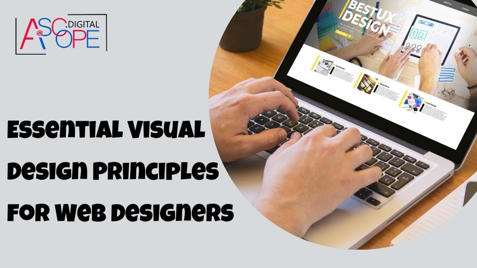
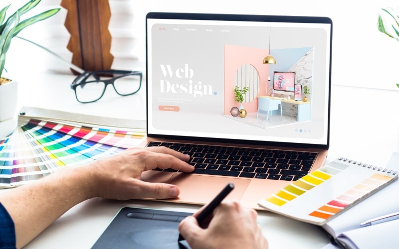
Web design is a complex field that combines creativity and technical skills to create visually appealing and functional websites. For web designers, understanding and applying essential visual design principles is crucial to crafting user-friendly, aesthetically pleasing sites. This blog will delve into the key principles that every web designer should master to enhance their design capabilities and produce top-tier websites.
Understanding Visual Design Principles
Before diving into specific principles, it’s important to understand what visual design principles are. These principles are fundamental guidelines that designers use to create effective and attractive visual compositions. They help ensure that a design is both functional and pleasing to the eye, making it easier for users to navigate and interact with a website.
Balance
Balance in web design refers to the distribution of visual weight within a composition. It can be achieved through symmetry, asymmetry, or radial balance. Symmetrical balance involves mirroring elements on either side of a central axis, creating a sense of stability. Asymmetrical balance uses different elements of varying weights to create a dynamic, yet balanced, composition. Radial balance involves elements radiating from a central point, often seen in circular layouts.
Symmetrical Balance
Symmetrical balance provides a sense of order and structure, making it easier for users to process information. It’s commonly used in corporate websites and portfolios where a professional, organized appearance is desired.
Asymmetrical Balance
Asymmetrical balance, on the other hand, adds interest and movement to a design. By using contrasting elements and weights, designers can create visually engaging and dynamic layouts that draw users’ attention to specific areas.
Radial Balance
Radial balance is less common but can be highly effective for specific designs, such as logo designs or websites with circular navigation systems. This type of balance creates a focal point, directing users’ attention to the center of the composition.
Contrast

Contrast is the difference between two or more elements in a design, making it easier to distinguish between them. It can be achieved through color, size, shape, texture, and typography. High contrast can draw attention to specific elements, while low contrast can create a more cohesive and harmonious look.
Color Contrast
Using contrasting colors can highlight important information and guide users’ focus. For example, a bright button on a dark background will stand out more and prompt user interaction.
Size and Shape Contrast
Varying the size and shape of elements can also create visual interest and emphasize key points. Larger elements typically draw more attention, while unique shapes can differentiate important features from the rest of the design.
Hierarchy
Visual hierarchy refers to the arrangement of elements in a way that signifies their importance. By using different sizes, colors, and placements, designers can guide users through the content in a logical order, ensuring that the most critical information is noticed first.
Size and Scale
Larger elements naturally draw more attention, making them ideal for headlines and important calls-to-action (CTAs). Smaller elements, like body text, should support these primary elements without overwhelming them.
Color and Contrast
Using color and contrast strategically can help establish hierarchy. Brighter or more saturated colors can emphasize key points, while muted colors can recede into the background.
Position and Alignment
The placement of elements can also influence hierarchy. Elements placed higher on the page or closer to the center tend to be noticed first. Alignment can create visual connections between elements, helping users understand their relationships.
Alignment
Alignment ensures that elements in a design are visually connected, creating a cleaner and more organized look. It can be achieved through the use of grids, guides, and consistent spacing.
Grids and Guides
Grids and guides provide a framework for alignment, helping designers position elements consistently. This not only improves the aesthetic appeal of a design but also enhances usability by making navigation more intuitive.
Consistent Spacing
Consistent spacing between elements creates a sense of order and predictability. It ensures that related items are grouped together and that the design is easy to scan.
Repetition

Repetition involves using the same or similar elements throughout a design to create a cohesive and unified look. It helps reinforce brand identity and improve user recognition.
Consistent Typography
Using consistent fonts, sizes, and styles for headings, subheadings, and body text creates a cohesive look and enhances readability. It also helps establish a visual hierarchy and makes the content easier to scan.
Repeated Elements
Repeating elements such as icons, buttons, and colors can create a sense of familiarity and continuity. This makes the design more user-friendly and reinforces the overall theme.
Proximity
Proximity refers to the spatial relationship between elements. Grouping related items together and separating unrelated items can improve the organization and readability of a design.
Grouping Related Elements
By placing related elements close together, designers can create visual connections that help users understand their relationships. For example, grouping navigation links together makes it clear that they are part of the same menu.
Separating Unrelated Elements
Separating unrelated elements with whitespace or dividers can help prevent clutter and make the design easier to navigate. This ensures that users can quickly find the information they need.
Whitespace
Whitespace, or negative space, is the empty space around and between elements in a design. It can improve readability, create a sense of luxury and sophistication, and highlight important elements.
Enhancing Readability
Whitespace improves readability by reducing visual clutter and making it easier for users to focus on the content. It can also create a more relaxed and comfortable user experience.
Creating Emphasis
Strategic use of whitespace can draw attention to key elements, such as CTAs or important messages. By surrounding these elements with ample space, designers can make them stand out more effectively.
Typography
Typography plays a crucial role in web design, influencing readability, user experience, and overall aesthetics. It involves the selection and arrangement of typefaces to convey a message and enhance the design.
Font Selection
Choosing the right fonts is essential for creating an effective design. Designers should consider factors such as readability, brand identity, and the overall tone of the website when selecting typefaces.
Hierarchical Typography
Using different font sizes, weights, and styles can create a clear typographic hierarchy, guiding users through the content in a logical order. Headings should be more prominent, while body text should be easily readable.
Line Spacing and Letter Spacing
Proper line spacing (leading) and letter spacing (tracking) are crucial for readability. Adequate spacing between lines and characters ensures that the text is comfortable to read and doesn’t appear cramped.
Color Theory
Color theory involves understanding how colors interact and the psychological impact they have on users. It’s a fundamental aspect of web design, influencing mood, branding, and usability.
Color Schemes
Using color schemes such as monochromatic, analogous, or complementary can create harmony and balance in a design. These schemes help ensure that the colors work well together and support the overall aesthetic.
Psychological Impact
Different colors evoke different emotions and associations. For example, blue is often associated with trust and professionalism, while red can signify urgency or excitement. Understanding these associations can help designers choose colors that align with the brand and the desired user experience.
Accessibility
Color choices should also consider accessibility. Ensuring sufficient contrast between text and background colors is essential for readability, especially for users with visual impairments.
Imagery and Graphics
Imagery and graphics are powerful tools in web design, capable of conveying messages quickly and effectively. They can enhance the visual appeal of a website and provide visual context for the content.
Quality and Relevance
High-quality, relevant images and graphics can significantly improve the user experience. They should support the content and reinforce the overall theme and branding of the website.
Consistency
Consistent use of imagery and graphics creates a cohesive look and feel. This includes using a similar style, color palette, and tone throughout the design.
Optimization
Images and graphics should be optimized for web use to ensure fast loading times and good performance. This involves using appropriate file formats, compressing images, and implementing responsive design techniques.
Visual Flow
Visual flow refers to the way users’ eyes move through a design. By guiding users through a logical path, designers can ensure that important information is noticed and understood.
Focal Points
Creating focal points through the use of contrast, size, and placement can help direct users’ attention to key elements. This can include headlines, CTAs, and important messages.
Directional Cues
Directional cues such as arrows, lines, and the arrangement of elements can guide users through the content. These cues create a visual path that leads users from one element to the next.
Scrolling and Navigation
The design should facilitate smooth scrolling and intuitive navigation, ensuring that users can easily move through the content and find what they’re looking for.
Feedback and Interaction
Feedback and interaction are essential components of user experience design. Providing visual feedback for user actions and creating interactive elements can enhance usability and engagement.
Visual Feedback
Visual feedback such as hover effects, button animations, and loading indicators informs users about the status of their actions. This helps create a more responsive and interactive experience.
Interactive Elements
Interactive elements such as buttons, forms, and sliders should be designed to be intuitive and easy to use. Clear visual cues and affordances can help users understand how to interact with these elements.
Consistency
Consistent feedback and interaction patterns create a predictable and reliable user experience. This helps users feel more confident and comfortable navigating the website.
Accessibility
Accessibility is a crucial aspect of web design, ensuring that websites are usable by all people, regardless of their abilities. This involves designing for a wide range of users, including those with disabilities.
Color Contrast
Ensuring sufficient color contrast between text and background elements is essential for readability, especially for users with visual impairments.
Text Alternatives
Providing text alternatives for non-text content, such as images and videos, ensures that all users can access the information. This includes using alt text for images and captions for videos.
Keyboard Navigation
Designing for keyboard navigation allows users who cannot use a mouse to interact with the website. This involves ensuring that all interactive elements are accessible via keyboard shortcuts.
Responsive Design
Responsive design ensures that a website is usable on a variety of devices and screen sizes. This includes using flexible layouts, scalable images, and touch-friendly elements.
Usability Testing

Usability testing is the process of evaluating a website by testing it with real users. This helps identify usability issues and areas for improvement.
User Feedback
Gathering feedback from real users provides valuable insights into how the design performs in practice. This can include conducting surveys, interviews, and usability tests.
Iterative Design
Usability testing should be an ongoing process, with regular testing and iteration to continuously improve the design. This involves making adjustments based on user feedback and testing the changes to ensure they enhance usability.
Performance Metrics
Tracking performance metrics such as load times, bounce rates, and user engagement can provide quantitative data on the design’s effectiveness. This helps identify areas where the design can be optimized for better performance.
Conclusion
Mastering essential visual design principles is crucial for web designers looking to create effective and aesthetically pleasing websites. By understanding and applying principles such as balance, contrast, hierarchy, alignment, repetition, proximity, whitespace, typography, color theory, imagery, visual flow, feedback and interaction, accessibility, and usability testing, designers can craft websites that not only look great but also provide an excellent user experience.
As web design continues to evolve, staying up-to-date with these principles and regularly refining your skills will help you remain competitive and produce top-quality designs. Remember, the goal of web design is not just to create visually appealing websites but to create functional, user-friendly sites that meet the needs of their users.