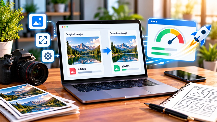
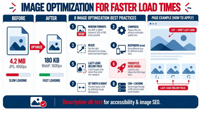
Image optimization means delivering images in the smallest file size possible without visible quality loss, at the right dimensions for each device, and in a way that doesn't block page rendering. The core best practices are: use modern formats like WebP and AVIF, compress images, resize them to their display size, serve responsive images with srcset, lazy-load below-the-fold images (but not the main hero image), set width and height to prevent layout shifts, prioritize the largest above-the-fold image, use a CDN, and add descriptive alt text. Because images are often the largest files on a page, optimizing them is one of the fastest ways to improve page speed, Core Web Vitals, SEO, and conversions. Here's how to do it.
Why Image Optimization Matters
- Faster load times: images frequently make up the largest share of page weight
- Better Core Web Vitals: the Largest Contentful Paint (LCP) element is often an image
- Improved SEO: speed and page experience support rankings, and optimized images can appear in image search
- Lower bounce rates: visitors abandon slow pages, especially on mobile
- Reduced bandwidth costs for you and your visitors
The broader speed checklist is in how to speed up your website.
Choose the Right Image Format
| Format | Best For | Notes |
|---|---|---|
| AVIF | Photos and complex images | Excellent compression; widely supported in modern browsers |
| WebP | Photos and graphics | Strong compression and broad browser support; great default |
| JPEG | Photos (fallback) | Universal support; larger than WebP/AVIF |
| PNG | Graphics needing transparency or sharp edges | Can be large for photos; consider WebP with transparency |
| SVG | Logos, icons, simple illustrations | Vector, scalable, tiny files; sanitize uploaded SVGs |
| GIF | Simple animations | Often large; consider video (MP4/WebM) or animated WebP instead |
Use the <picture> element to serve AVIF or WebP with a fallback for older browsers where needed.
Compress Images
Compression reduces file size:
- Lossy compression removes some data for much smaller files; quality around 70–85% is often visually indistinguishable for photos
- Lossless compression reduces size without quality loss, but with smaller savings
Tools include Squoosh, TinyPNG, ImageOptim, ShortPixel, Imagify, and build-time optimizers. WordPress plugins can compress automatically on upload — see top plugins to enhance your WordPress site.
Resize Images to Display Dimensions
Never upload a 4000-pixel-wide photo to display at 800 pixels. Resize images to the largest size they'll appear, accounting for high-density screens (often about 2× the CSS display size for important images).
Serve Responsive Images
Use srcset and sizes so browsers download the right image for each screen:
<img src="hero-800.webp"
     srcset="hero-400.webp 400w, hero-800.webp 800w, hero-1600.webp 1600w"
     sizes="(max-width: 600px) 100vw, 800px"
     width="800" height="450"
     alt="Team reviewing a website redesign on a laptop">
Phones download smaller files, while large screens get sharper images. Responsive design techniques are covered in responsive design techniques for mobile-friendly websites.
Lazy-Load Below-the-Fold Images
Add loading="lazy" to images that appear below the initial viewport so they load only as users scroll. Do not lazy-load the hero or LCP image, because delaying it slows Largest Contentful Paint.
Prioritize the LCP Image
For the main above-the-fold image:
- Add
fetchpriority="high" - Consider preloading it with
<link rel="preload"> - Avoid loading it through slow JavaScript or CSS background images when possible
- Serve it from a fast CDN
Set Width and Height to Prevent Layout Shift
Always include width and height attributes (or CSS aspect-ratio) so browsers reserve space before images load. This prevents content from jumping and improves Cumulative Layout Shift (CLS).
Use a CDN and Caching
Image CDNs deliver files from servers near visitors, and many automatically convert formats, resize, and compress on the fly. Set long cache lifetimes for images with versioned filenames.
Write Descriptive Alt Text and File Names
- Alt text: describe the image's content and purpose for screen readers and search engines (e.g., "Navy waterproof hiking jacket with hood")
- File names: use descriptive, hyphenated names ("navy-waterproof-hiking-jacket.webp") instead of "IMG_4832.jpg"
- Decorative images: use empty alt text (
alt="")
Image search and product imagery tips are covered in how to optimize your product pages for SEO.
Image Optimization Checklist
| Task | Target |
|---|---|
| Format | AVIF or WebP with fallback where needed |
| Compression | Visually lossless at the smallest size |
| Dimensions | No larger than needed (about 2× display size for key images) |
| Responsive images | srcset and sizes for content images |
| Lazy loading | Below-the-fold only |
| LCP image | fetchpriority="high", preloaded if needed |
| Width/height | Set on every image |
| CDN and caching | Enabled with long cache lifetimes |
| Alt text and file names | Descriptive and accurate |
How to Measure Results
Test pages with PageSpeed Insights and Lighthouse for "Properly size images," "Serve images in next-gen formats," and "Largest Contentful Paint element" diagnostics. Monitor Core Web Vitals in Search Console and compare page weight before and after optimization. Mobile-specific tips are in how to optimize your site for mobile page speed.
Image Optimization on WordPress
WordPress sites can apply most best practices with the right setup:
- Use an image optimization plugin to compress uploads and convert to WebP or AVIF
- Rely on WordPress's built-in responsive
srcsetgeneration for content images - Confirm native lazy loading isn't applied to the first content or hero image
- Regenerate thumbnails after changing theme image sizes
- Delete unused image sizes your theme doesn't need to reduce storage
- Pair optimization with a caching plugin and CDN
Optimizing Background and Decorative Images
CSS background images can't use srcset directly, and browsers discover them later than <img> tags. Use image-set() for format and resolution variants, avoid using a background image for the LCP element when possible, and replace decorative textures with lightweight CSS gradients or SVG patterns. For animated content, short muted MP4 or WebM loops are usually far smaller than GIFs.
Key Takeaways
- Images are often the heaviest files on a page, so optimizing them has a big speed impact.
- Use AVIF or WebP, compress images, and resize them to display dimensions.
- Serve responsive images and lazy-load below-the-fold images, but prioritize the LCP image.
- Set width and height to prevent layout shifts, and use a CDN with caching.
- Add descriptive alt text and file names for accessibility and image SEO.
Frequently Asked Questions
What is image optimization?
Image optimization is reducing image file sizes and delivering images efficiently without noticeable quality loss. It includes using modern formats like WebP or AVIF, compressing and resizing images, serving responsive versions, lazy-loading offscreen images, and setting dimensions to prevent layout shifts.
What is the best image format for websites?
WebP and AVIF are generally best for photos and complex images because they offer strong compression and broad support in modern browsers. SVG is best for logos and icons, while PNG is useful for graphics needing transparency when WebP isn't suitable.
Should I lazy-load all images?
No. Lazy-load images below the initial viewport, but load the main hero or Largest Contentful Paint image immediately, ideally with high fetch priority. Lazy-loading the hero image can delay rendering and hurt Core Web Vitals.
How big should website images be?
Images should be no larger than the size they display, with key images often provided at about twice their CSS display size for high-resolution screens. Use responsive images so mobile devices download smaller versions, and compress files to keep them lightweight.
Does image optimization improve SEO?
Yes. Optimized images make pages load faster and improve Core Web Vitals, which support page experience and user engagement. Descriptive alt text and file names also help search engines understand images and can improve visibility in image search.
Want a faster site without sacrificing visual quality? AiScope Digital's website development and design services include image optimization, CDN setup, and Core Web Vitals improvements — get a free speed audit today.