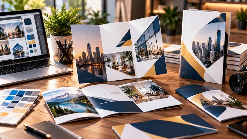
Innovative brochure design turns a disposable handout into a brand experience people keep: unusual folds, tactile finishes, interactive elements, and digital hybrids that bridge print to your website. In a 2026 marketing mix dominated by screens, a beautifully engineered printed piece cuts through precisely because it's physical — print consistently scores higher on recall and trust than digital-only touchpoints, according to industry research. Here's how to design brochures that elevate your marketing rather than pad a drawer.
Why Brochures Still Earn Their Place in 2026
- Tangibility builds trust. A substantial, well-printed piece signals an established business in a way a PDF can't.
- Zero algorithm. Nothing stands between your brochure and the reader — no feed, no filter, no ad blocker.
- Context control. Trade shows, sales meetings, waiting rooms, direct mail — you choose the moment of attention.
- Longer shelf life. Memorable pieces get kept and passed along; a QR code makes every kept copy a trackable traffic source.
The qualifier: forgettable brochures are wasted budget. Innovation — in structure, finish, or concept — is what converts print spend into brand lift.
Choose the Right Format: Folds That Tell Stories
The fold is your information architecture — it controls the order ideas reveal themselves:
| Format | Panels | Best For | Innovation Potential |
|---|---|---|---|
| Tri-fold | 6 | Services overview, menus | Classic; elevate with finishes |
| Z-fold | 6 | Step-by-step stories, timelines | Sequential reveal |
| Gate fold | 6–8 | Premium reveals, launches | "Opening doors" drama |
| Accordion | 8+ | Product lines, portfolios | Panoramic spreads |
| Die-cut shapes | Any | Standing out anywhere | Shape echoes your product |
| Booklet (saddle-stitch) | 8–32 | Catalogs, lookbooks | Magazine credibility |
| Cross/French fold | 8 | Maps, posters-in-disguise | Unfolds into a keepsake |
Innovative move: design the unfolding as a narrative. A gate fold that opens on the word "Imagine…" to reveal a full-spread visual creates a moment a flat PDF never will.
Design Principles That Make Brochures Stunning
Hierarchy and the 3-Second Cover
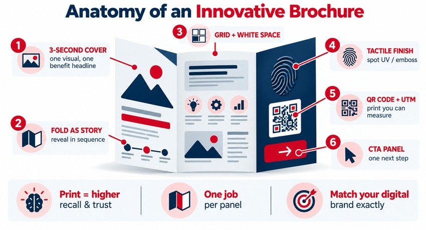
Your cover competes like a thumbnail: one strong visual, one benefit-led headline, your logo — nothing else. Inside, each panel gets one job, with headlines that let a skimmer reconstruct the whole pitch.
Grids, White Space, and Flow
Brochures fail by overcrowding. Build on a grid, let white space frame what matters, and design across the fold — spreads, not isolated panels. Grid craft is foundational; see creating effective layouts: grid systems and beyond.
Brand Consistency
Colors, typefaces, and imagery must match your website and socials exactly — a brochure is often the physical handshake after a digital introduction, and mismatches erode trust at the worst moment.
Photography Over Clip Art
Real product and team photography outperforms stock; if you must use stock, art-direct it with consistent color grading so it reads proprietary.
Innovative Elements Worth the Upcharge
Tactile and interactive touches are what move a brochure from "read" to "kept":
- Soft-touch lamination — velvet finish people can't stop handling
- Spot UV gloss over logos or key images against matte backgrounds
- Embossing/debossing for logos and headlines you can feel
- Foil accents — metallic restraint reads premium; metallic excess reads casino
- Die-cut windows that preview an inside visual
- Uncoated, textured, or seeded papers for organic and eco-positioned brands
- Interactive mechanics — pull tabs, wheels, perforated coupons or bookmarks
The digital hybrid layer (2026 standard): a QR code per section — portfolio video, booking page, AR product demo — with UTM parameters so print traffic is measurable in GA4. Print becomes a trackable channel instead of a leap of faith.
A Practical Design Process (Concept to Print)
- Define the job: audience, context (trade show? sales leave-behind?), and the single action you want taken.
- Write content first. Design wraps copy, not vice versa — draft headlines, body, and CTA before opening design software.
- Choose format and paper against budget and context: a die-cut gate fold for launch meetings; a sturdy tri-fold for counter displays.
- Design in spreads on a grid, in CMYK, at 300 DPI, with 3mm bleed.
- Prototype physically. Print and fold a home mockup — folds surprise you on paper in ways screens never reveal.
- Proof ruthlessly, then request a printed proof before the full run.
- Add measurement: QR codes with UTMs, a dedicated landing page or phone extension.
The same thinking scales down to single sheets — our guide on how to create stunning flyers covers the fast-format sibling — and scales up to environments like trade show booth design, where brochures do their hardest work.
Common Brochure Mistakes That Kill Results
| Mistake | The Fix |
|---|---|
| Cramming every service in | One theme per brochure; print two if needed |
| Cover = logo + address only | Benefit-led headline + hero visual |
| No call to action | One explicit next step, repeated on the back panel |
| Web-resolution images | 300 DPI originals, always |
| Ignoring the back panel | It faces up in racks — treat it as a second cover |
| Print-only dead end | QR + UTM on every piece |
Key Takeaways
- The fold is the story: choose formats (gate, accordion, die-cut) that reveal information deliberately.
- One job per panel, a 3-second cover, grid-and-white-space discipline.
- Tactile finishes (soft-touch, spot UV, emboss) are what make pieces get kept.
- Make print measurable: QR codes with UTM parameters on every brochure.
- Match your digital brand exactly — the brochure is the physical handshake.
Frequently Asked Questions
What makes a brochure design innovative?
Innovation shows up in structure (unusual folds, die-cuts), materials (textured papers, soft-touch lamination, foil), interactivity (pull tabs, QR-linked video or AR), and concept — designing the unfolding itself as a narrative. The test: does the piece get kept and shown to someone else?
What is the best fold for a marketing brochure?
Tri-fold remains the versatile default for service overviews. Choose a gate fold for premium reveals, Z-fold for sequential stories, accordion for product lines, and booklets for catalogs. Match the fold to your content's natural reading order rather than defaulting by habit.
What resolution and specs do print brochures need?
300 DPI images, CMYK color mode, 3mm bleed on all edges, and fonts embedded or outlined. Standard tri-folds print on A4/Letter sheets; always order a printed proof before the full run, since colors and folds behave differently on paper than on screen.
Are brochures still effective in digital marketing era?
Yes — as a complement, not a replacement. Print earns higher recall and trust than screen-only touchpoints and faces zero algorithmic filtering. The 2026 approach makes print measurable: QR codes with UTM tracking turn every brochure into an attributable traffic source.
How much does professional brochure design cost?
Freelance design typically runs $300–$1,500; agency work with copywriting and print management runs $1,500–$5,000+. Printing adds roughly $0.50–$3 per piece depending on stock, finishes, and volume. Premium finishes cost more but directly drive keep-rates.
A brochure is your brand you can hold. AiScope Digital's logo and visual identity design services extend to full print collateral — concept, copy, design, and print-ready files. Start the conversation about your next campaign piece.