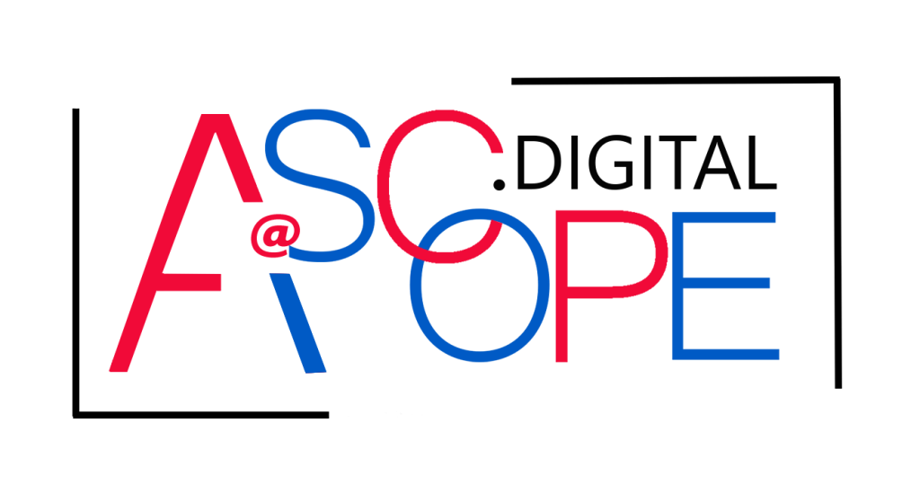
A wordmark logo (also called a logotype) is a logo made entirely of the brand's name, styled with distinctive typography, spacing, and sometimes a subtle custom detail. Wordmarks work because every exposure builds name recognition directly: customers see, read, and remember the name at the same time. Great wordmarks combine a short, distinctive name, a carefully chosen or custom-drawn typeface, precise kerning, and one memorable detail — then stay legible from a favicon to a billboard. Here's when to choose a wordmark, how to design one, and the mistakes that make text logos forgettable.
Wordmarks vs. Other Logo Types
| Logo Type | What It Is | Strengths | Limitations |
|---|---|---|---|
| Wordmark (logotype) | Full brand name in stylized type | Builds name recognition, simple, versatile | Long names get hard to read small |
| Lettermark (monogram) | Initials or abbreviation | Compact, great for long names | Needs awareness to mean something |
| Pictorial mark | Recognizable icon | Instant visual cue | Needs time to associate with the name |
| Abstract mark | Geometric or non-literal symbol | Unique, ownable | Meaning must be built |
| Combination mark | Symbol + wordmark | Flexible, explains itself | More complex to scale |
| Emblem | Text inside a badge or crest | Heritage, authority | Detail can be lost at small sizes |
If your name is long, an abbreviation may work better — see lettermark logos: simplifying brand identity.
When a Wordmark Is the Right Choice
- New brands that need name recognition: the logo teaches the name every time it appears
- Short, distinctive names: typically one or two words that look good in type
- Brands where the name itself is the asset: unique, coined, or memorable names
- Digital-first businesses: clean text scales well across interfaces and social profiles
- Service businesses: consultancies, agencies, and professional firms often prefer clarity over symbolism
Wordmarks are less suitable for very long names, names easily confused with competitors, or brands that need a standalone icon for app icons and favicons. Many brands solve the last issue with a wordmark plus a secondary monogram.
The Elements of a Memorable Wordmark
1. Typeface Choice
The typeface sets personality before anyone reads a word:
- Serif: tradition, credibility, editorial authority
- Geometric sans: modern, clean, tech-forward
- Humanist sans: friendly, approachable
- Slab serif: sturdy, bold
- Script: personal, elegant, handcrafted (use carefully for legibility)
- Custom lettering: fully ownable and distinctive
Typography guidance specific to logos is in typography in logos: choosing the right fonts.
2. Customization
Typing a name in a stock font isn't a logo; anyone can reproduce it. Professional wordmarks customize letterforms: adjusting stroke weight, modifying a terminal, joining letters with a ligature, or redrawing a key character. Fully custom typefaces are covered in custom fonts: designing unique typefaces.
3. Kerning and Spacing
Kerning adjusts space between specific letter pairs so the word looks evenly spaced. Default font spacing is designed for paragraphs, not logos. Optical kerning — adjusting by eye at large size — is what makes a wordmark look polished.
4. Case
- All caps: strong, stable, authoritative
- Lowercase: approachable, modern, informal
- Title case: balanced and familiar
5. A Signature Detail
Many memorable wordmarks rely on one distinctive feature: a hidden symbol in negative space, a unique letter shape, a color change on one letter, or an underline or swoosh. One detail makes it memorable; five details make it busy.
6. Color
Wordmarks often work in a single brand color, which strengthens recognition and simplifies reproduction. Color strategy is covered in mastering color theory in logo design.
[ Insert infographic image here — generation prompt in the comment below ]
The Wordmark Design Process
- Discovery: define brand personality, audience, competitors, and where the logo will appear. Research is the foundation, as covered in research and discovery: laying the foundation for great logos.
- Typeface exploration: set the name in dozens of typefaces across categories to see which personalities fit.
- Shortlist and sketch: choose three to five directions and sketch modifications to key letters.
- Digital refinement: redraw in vector software, customize letterforms, and perfect kerning.
- Scale testing: check legibility at tiny sizes (favicons, social avatars) and very large sizes (signage).
- Context mockups: website header, business card, packaging, storefront, social profile, and dark backgrounds.
- Finalize the system: primary wordmark, stacked or compact versions, monogram, color and one-color versions, clear space and minimum size rules.
Vector production techniques are in Adobe Illustrator: essential tips and tricks for logo design.
Common Wordmark Mistakes
| Mistake | Why It Hurts | Fix |
|---|---|---|
| Using a default font unchanged | Not distinctive or ownable | Customize letterforms and spacing |
| Poor kerning | Looks amateur, letters seem to drift | Optical kerning at large size |
| Overly decorative script | Illegible at small sizes | Test at 16–32px |
| Too many effects | Gradients and shadows age quickly | Flat, simple, one color |
| Trendy font choice | Dates the brand fast | Favor timeless forms with one fresh detail |
| No compact version | Breaks on favicons and app icons | Create a monogram or symbol companion |
| Confusing letter shapes | Name misread | Prioritize readability over novelty |
Questions to Answer Before Designing a Wordmark
A clear brief prevents endless revision rounds. Before exploring typefaces, answer:
- What three to five words describe the brand's personality?
- Who is the primary audience, and what do competitors' logos look like?
- Where will the logo appear most: screens, packaging, signage, vehicles, uniforms?
- Does the name have letters that create natural opportunities, such as repeated letters, round shapes, or a meaningful character?
- Must the logo work in one color, on dark backgrounds, or in embroidery and engraving?
- Is a compact companion mark needed for favicons, app icons, and social avatars?
These answers narrow the typeface direction quickly and give everyone involved an objective way to evaluate concepts instead of relying on personal taste.
Wordmarks in a Responsive Brand System
Modern brands need logos that adapt: a full wordmark for headers, a condensed version for narrow spaces, and a single-letter or symbol version for tiny placements. This responsive approach is explained in responsive logos: designing for different screen sizes.
Key Takeaways
- A wordmark is the brand name as the logo, building name recognition with every view.
- It works best for short, distinctive names and brands that want clarity.
- Typeface, customization, kerning, case, one signature detail, and color create memorability.
- Test legibility from favicon to billboard and build a monogram companion for tiny sizes.
- Avoid default fonts, weak spacing, decorative excess, and trend-chasing.
Frequently Asked Questions
What is a wordmark logo?
A wordmark logo, or logotype, is a logo made entirely of the brand name in distinctive typography. Instead of a symbol, it relies on typeface choice, custom letterforms, spacing, case, and color to create a recognizable mark that also teaches people the company's name.
When should a business use a wordmark logo?
A wordmark is a strong choice for businesses with short, distinctive names, new brands building name recognition, and companies that value clarity across digital and print. Very long names or brands needing a compact standalone icon may benefit from a lettermark or combination mark instead.
What's the difference between a wordmark and a lettermark?
A wordmark uses the full brand name, while a lettermark uses initials or an abbreviation. Wordmarks build direct name recognition; lettermarks are more compact and work well for long names but rely on audiences already knowing what the initials represent.
Can I use a free font for a wordmark logo?
You can start with a free or licensed font if its license allows logo use, but unmodified fonts make logos easy to copy and harder to trademark distinctively. Customize letterforms, kerning, and details to make the wordmark ownable, and always confirm the font license permits commercial logo use.
How do I make a text-based logo memorable?
Choose typography that matches your brand personality, customize at least one letterform, perfect the kerning, keep the design simple, and add one signature detail such as a unique letter, negative-space element, or accent color. Then use it consistently everywhere.
Your name deserves a logo as memorable as your work. AiScope Digital's logo and visual identity design services craft custom wordmarks and complete identity systems — start the conversation today.