
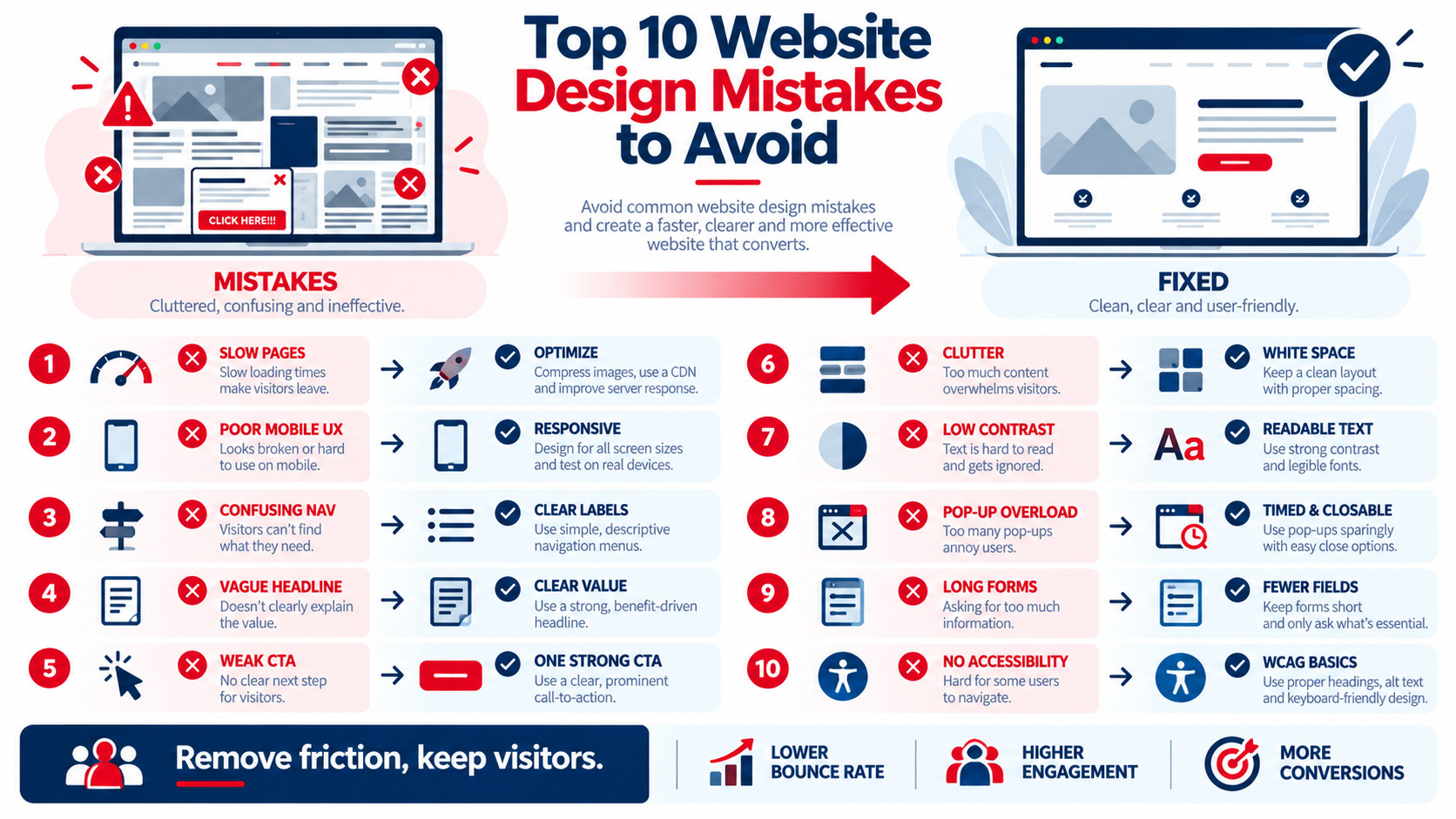
The most damaging website design mistakes are the ones that make visitors wait, work, or wonder. The top 10 to avoid are: slow-loading pages, poor mobile experience, confusing navigation, unclear value proposition, weak or missing calls to action, cluttered layouts, low contrast and hard-to-read text, intrusive pop-ups, long or broken forms, and ignoring accessibility. Each one adds friction that drives visitors away, lowers conversions, and can hurt search visibility. The good news: most are fixable without a full redesign. This guide explains why each mistake hurts user experience, how to spot it on your own site, and exactly how to fix it.
The 10 Mistakes at a Glance
| # | Mistake | UX Impact | Quick Fix |
|---|---|---|---|
| 1 | Slow-loading pages | Visitors leave before content appears | Optimize images, scripts, hosting, caching |
| 2 | Poor mobile experience | Zooming, mis-taps, abandonment | Responsive, mobile-first layouts |
| 3 | Confusing navigation | Visitors can't find key pages | Clear labels, simple menus, search |
| 4 | Unclear value proposition | Visitors don't know what you offer | Benefit-driven headline above the fold |
| 5 | Weak or missing CTAs | No clear next step | One prominent, action-oriented CTA per page |
| 6 | Cluttered layouts | Overwhelm and distraction | White space, hierarchy, fewer elements |
| 7 | Low contrast, hard-to-read text | Strain, skipped content | Readable fonts, sizes, and contrast |
| 8 | Intrusive pop-ups | Blocked content, frustration | Delayed, easy-to-close, relevant pop-ups |
| 9 | Long or broken forms | Drop-offs and lost leads | Fewer fields, clear errors, testing |
| 10 | Ignoring accessibility | Excludes users, legal risk | Follow WCAG basics |
Mistake 1: Slow-Loading Pages
Why it hurts: Visitors expect pages to appear quickly. Blank screens and sluggish interactions create doubt and abandonment, and Core Web Vitals influence search performance.
How to spot it: PageSpeed Insights, Search Console's Core Web Vitals report, and testing on a real phone over mobile data.
How to fix it: Compress and resize images, remove unused scripts, enable caching and a CDN, and upgrade hosting if needed — see website loading speed optimization.
Mistake 2: Poor Mobile Experience
Why it hurts: Most visits come from phones, and Google uses mobile-first indexing. Tiny text, crowded buttons, and sideways scrolling push visitors away.
How to spot it: Use your site on a phone. Try calling, filling a form, and finding a service.
How to fix it: Responsive layouts, 16px+ body text, large tap targets, sticky CTAs, and click-to-call — see why every business needs a responsive website design in 2026.
Mistake 3: Confusing Navigation
Why it hurts: If visitors can't find services, pricing, or contact information quickly, they leave.
How to spot it: Heatmaps showing repeated menu clicks, high exits from the homepage, and site search for basic terms.
How to fix it: Use clear labels ("Services," "Pricing," "Contact"), limit top-level items, add breadcrumbs, and keep key pages within a few clicks — see website architecture best guide.
Mistake 4: Unclear Value Proposition
Why it hurts: Visitors decide in seconds whether a site is relevant. Vague headlines like "Welcome to Our Website" waste that moment.
How to fix it: State what you do, who it's for, and the benefit — "Fort Lauderdale Roof Repair in 24 Hours — Free Inspections" — supported by a subheadline and CTA.
Mistake 5: Weak or Missing CTAs
Why it hurts: Without a clear next step, interested visitors drift away.
How to fix it: Use one primary CTA per page with action-oriented text ("Get My Free Quote"), high contrast, and placement above the fold and after key sections — see effective landing page optimization.
Mistake 6: Cluttered Layouts
Why it hurts: Too many images, banners, fonts, and competing messages overwhelm visitors and bury what matters.
How to fix it: Establish visual hierarchy, use white space generously, limit fonts and colors, and remove elements that don't support the page goal — see UX/UI basics: a beginner's guide to modern web design principles.
Mistake 7: Low Contrast and Hard-to-Read Text
Why it hurts: Light grey text on white, tiny fonts, and long unbroken paragraphs strain readers and fail accessibility guidelines.
How to fix it: Aim for at least 4.5:1 contrast for body text, comfortable line height, short paragraphs, descriptive subheadings, and readable fonts — see typography trends in web design.
Mistake 8: Intrusive Pop-Ups
Why it hurts: Pop-ups that cover content immediately, especially on mobile, frustrate visitors and can affect how search engines view page experience.
How to fix it: Delay pop-ups until engagement (scroll depth or time), make them easy to close, keep them relevant to the page, and use slim banners on mobile.
Mistake 9: Long or Broken Forms
Why it hurts: Every unnecessary field increases drop-off, and broken forms silently lose leads.
How to fix it: Ask only for essentials, use correct input types and autofill, show clear error messages, confirm submissions, and test forms monthly on desktop and mobile.
Mistake 10: Ignoring Accessibility
Why it hurts: Inaccessible sites exclude people with disabilities, frustrate many other users, and create legal risk.
How to fix it: Add alt text, keyboard navigation, visible focus states, form labels, and sufficient contrast; follow WCAG 2.2 guidelines and test with tools like WAVE or axe.
Bonus Mistakes Worth Avoiding
| Mistake | Better Approach |
|---|---|
| Auto-playing video with sound | Let visitors choose to play; mute by default |
| Generic stock photos | Real team, product, and customer images |
| Hidden contact information | Phone, email, and address in header or footer |
| Outdated content and copyright year | Regular content reviews and maintenance |
| No trust signals | Reviews, testimonials, certifications, case studies |
| Broken links and 404 errors | Regular link checks and redirects |
Trust-building design elements are covered in how website aesthetics impact trust and credibility.
How to Audit Your Site for These Mistakes
- Run speed tests on key templates with PageSpeed Insights
- Use your site on a phone and complete your top three tasks
- Review heatmaps and recordings for rage clicks, dead clicks, and confusion — see website heatmaps optimization for designs
- Check analytics for high-exit pages and form abandonment
- Run accessibility scans and manual keyboard tests
- Ask five real users to complete tasks while you observe
- Prioritize fixes by impact and effort
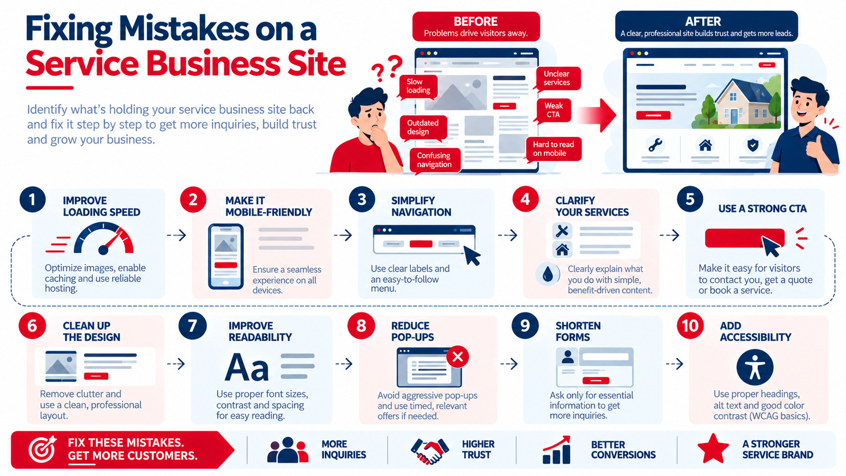
Example: Fixing Mistakes on a Service Business Site
 s
A cleaning company's homepage had a slider with five rotating messages, a vague headline, light grey text, a pop-up on page load, and a nine-field quote form. The team replaced the slider with a single benefit-driven headline and CTA, increased text contrast, delayed the pop-up until 50% scroll, and cut the form to four fields. Mobile visitors found the quote form faster, and quote requests increased. Use your real figures to track the impact of each fix.
Key Takeaways
- The worst design mistakes make visitors wait, work, or wonder.
- Speed, mobile UX, navigation, clear messaging, and strong CTAs matter most.
- Reduce clutter, improve readability, and use pop-ups respectfully.
- Keep forms short and functional, and build in accessibility.
- Audit regularly with speed tests, heatmaps, analytics, and real users.
Frequently Asked Questions
What are the most common website design mistakes?
Common mistakes include slow-loading pages, poor mobile experiences, confusing navigation, unclear value propositions, weak CTAs, cluttered layouts, low-contrast text, intrusive pop-ups, long forms, and ignoring accessibility.
How do website design mistakes affect SEO?
Mistakes like slow speed, poor mobile usability, intrusive interstitials, and confusing structure can hurt page experience and engagement, which can affect search visibility. Clear navigation and fast pages also help search engines crawl and understand your site.
How can I tell if my website has design problems?
Test your site on mobile, run speed and accessibility checks, review heatmaps and session recordings, analyze high-exit pages and form drop-offs in analytics, and watch real users try common tasks.
Do I need a full redesign to fix these mistakes?
Not always. Many issues — such as improving speed, clarifying headlines, strengthening CTAs, shortening forms, and fixing contrast — can be addressed with targeted updates. A redesign may be needed if problems are structural or the platform is outdated.
How often should I review my website's design?
Review key pages and metrics at least quarterly, and after major content, product, or technology changes. Continuous small improvements based on data help prevent mistakes from building up.
Want a website free of costly design mistakes? AiScope Digital's website development and design services audit and fix UX issues that cost you customers — get a free website review today.